Color affects our emotions. Whole volumes have been written describing these effects, and how artists and advertisers use color to best induce specific emotions. Color also has profound effects on the perceived depth of any two-dimensional representation of our three-dimensional world.
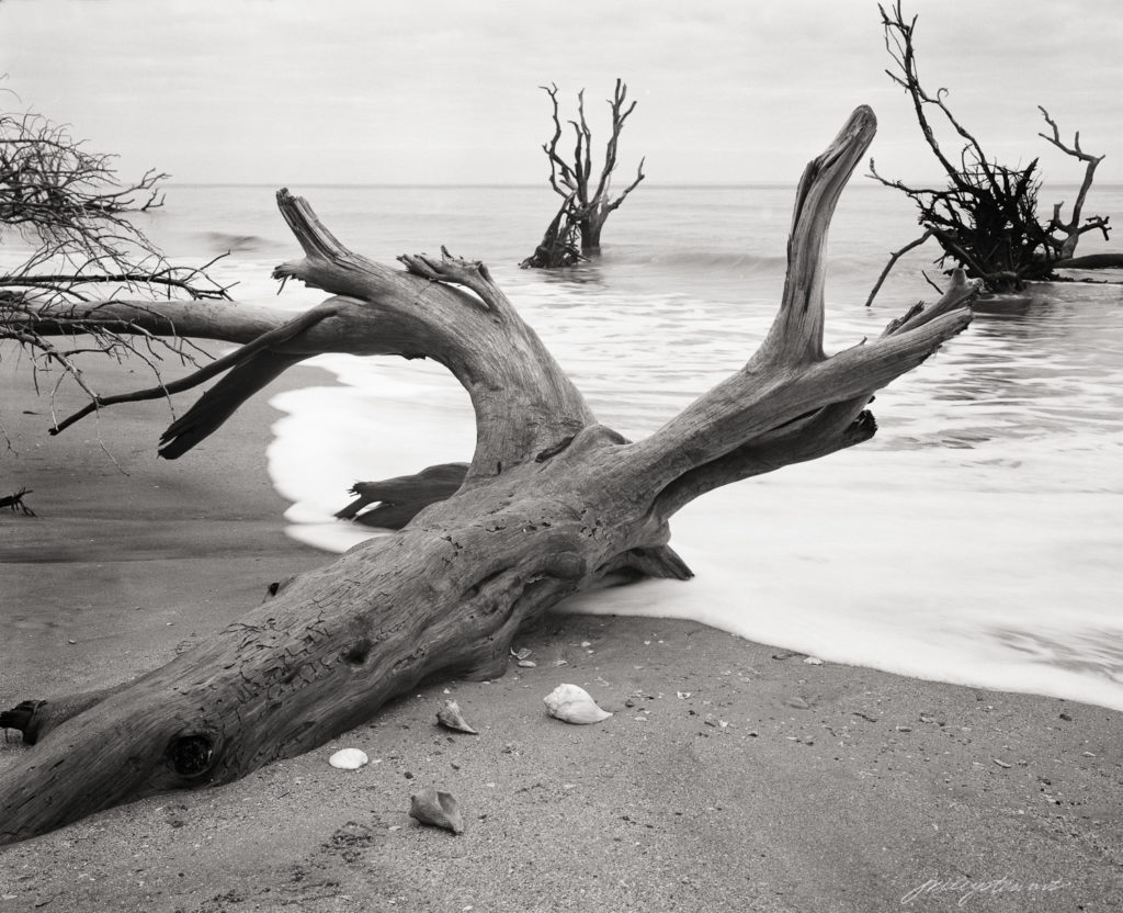
To make the point, look at the three squares below. Which color, blue or red, seems ‘closer’ to you? This example is a good way to show how our eyes play tricks on us when it comes to color alone. If you see the red square appear to be in front of the blue squares, that is the typical response. There is a biological explanation for this effect, but the result is that “warm (e.g., red) colors project” and “cool (e.g., blue) colors recede.”
How does this relate to the psychology of B&W (so called, “monochrome”) prints?
I’ve been creating B&W prints for years, but the truth is, I don’t really care for “black and white” prints. I much prefer “purple and white” or “eggplant and white,” and for some subjects, “brown and white.”
The 20th Century masters of landscape photography touted the physical and emotional effects of toning their B&W prints. There were dozens of techniques and materials used to impart colors selectively to silver gelatin prints. Among the most widely used was a selenium chloride solution. Depending on the paper and developer used to print the image, bathing the print in a weak solution of selenium chloride for a few minutes materially changed the color of the print to what Ansel Adams called an “eggplant” color, most noticeable in the darker shadow areas.
I loved the aesthetic effect selenium toning had on my prints, so it became a standard part of my darkroom workflow, and now continues in my hybrid workflow.
What was that effect?
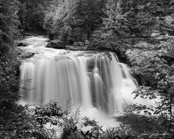
Take a look at the two images below. The first is a straight “monochrome” depiction of Blackwater Falls in West Virginia. It’s a beautiful image, full of light and excitement and depth. These characteristics are imparted solely by the subjects, which are entirely shades of neutral gray (you may see color, but it’s because your monitor is not neutral–most are not). This depiction represents what comes out of the standard B&W developer or when you convert an image to B&W in a digital workflow.
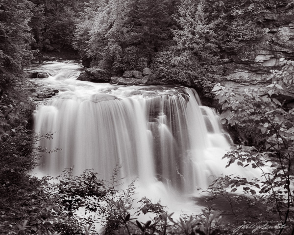
Now look at the second image. It was given a treatment that selectively toned the shadow areas as if the print was toned in my darkroom method for selenium toning. The mid tones and shadow areas now have this deep purple (so called “eggplant”) tone.
“Blackwater Falls at Full Force” – Limited edition archival pigment print, up to 40×32 inches
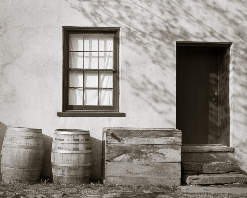
There are many other tones besides the ‘eggplant’ of selenium toner that artists can choose to use. For some images, I like a warmer tone that mimics Kodak Brown Toner I used to use on wet prints made in the darkroom. Brown toner is very effective in giving a more nostalgic aesthetic to some subjects, such as those in my Virginia Grist Project and other old architectural subjects, like “Dappled Shadows” below.
“Dappled Shadows on a Store Front” – warmer brown tones gives a nostalgic aesthetic to old architectural subjects.
How do you feel about the two different presentations? If the second image appears to have more depth in the shadows, it’s because the cooler purple color appears to recede behind the screen surface; the comparatively warmer whites appear to be in front of the shadows. This therefore tends to push the highlights in the water forward and causes the trees and other shadows to fall back into the image, much like the red and blue squares above, creating a greater sense of depth in the image. Depth in a two-dimensional picture encourages the viewer to want to engage in the picture, something all visual artists want from our audience.
There is also an emotional aspect to the image I think is important. Hues in the purple range are known to induce a sense of calm and creativity, of wonder and exploration. Purple is a very emotional color to most humans. The toned image of this enormous waterfall therefore creates an internal conflict that is very subtle, but still there. First, you stand before this potentially dangerous, powerful, noisy waterfall that most of us react to with a bit of anxiety, red flags goes up in your consciousness: beware! But surrounding the waterfall on all aspects is this calming tone that encourages exploration of the shoreline, the trees, the flowers and rocks along the river’s banks. This is a conceptual contrast, and one I think adds drama and excitement in the toned print that isn’t so apparent in the untoned print.
I always tone my B&W prints, varying between a cooler (more bluish) to a warmer (more reddish) selenium tone, depending on the subject of the photograph. It’s always a very subtle tone, not even as much as I’ve shown you in the second image above, which I exaggerated for purposes of this article.
If you make B&W prints (or even web images), experiment with toning to emphasize the feelings you want to compel in viewers. There is a infinite number of possibilities. In Lightroom, use the Split Toning feature to do this. For the toned image above, I set the Highlight toning saturation to 0 and the Shadow saturation to 9, hue 354. I set Balance to +50, favoring toning to the shadows.
To my heart, monochrome images should be way more than black and white!
Do you already tone your B&W images? What are your experiences? Let me hear your thoughts.
Photographers who scan film will eventually ask themselves whether it’s worth the cost to get a drum scan of their negatives. Let’s discuss how drum scanning compares to flatbed scanning to learn when you might need the extra quality provided by that mystical drum scanner.
I’ve used film as my image recording tool since the early 1980s. I once printed the images in a wet darkroom on sensitized paper, but have since moved to scanning the negatives and using the resulting digital images to modify and make prints using inkjet printers. This is called the hybrid workflow, and most film users use it today, partially or totally.
Resolution and acuity are two very common ways to assess technical quality of photographic images. Resolution refers to how much subject detail is retained in the image or print. Acuity refers to the sharpness of fine edges and lines.
I own and use both the Epson V700 flatbed scanner and the Howtek 4500 drum scanner. I’ve made thousands of scans from each, so I think I’m qualified to help you answer “Do I need a drum scan?”
My needs for scanning will likely differ from yours. I like to make large high resolution prints. I’ve sold hundreds of such prints, and many up to 32×40 inches in size from medium- and large-format negatives. My experience with 35mm negatives isn’t vast, but I’ve scanned perhaps hundreds of them for evaluation or printing.
Large size prints demand the highest level of scanning resolution. Any lapse in quality will utterly destroy the feeling of a print needing a high sense of texture or subject clarity. But how much resolution is enough? Can you get by with a more affordable, small flatbed scanner or do you need to drum scan your negatives?
I’m going to show you a real life test that will illustrate the difference in resolving power of a drum scanner and a modern Epson V700 flatbed scanner. I’m using a 4×5 negative, but you can reasonably extrapolate my findings to any size negative.
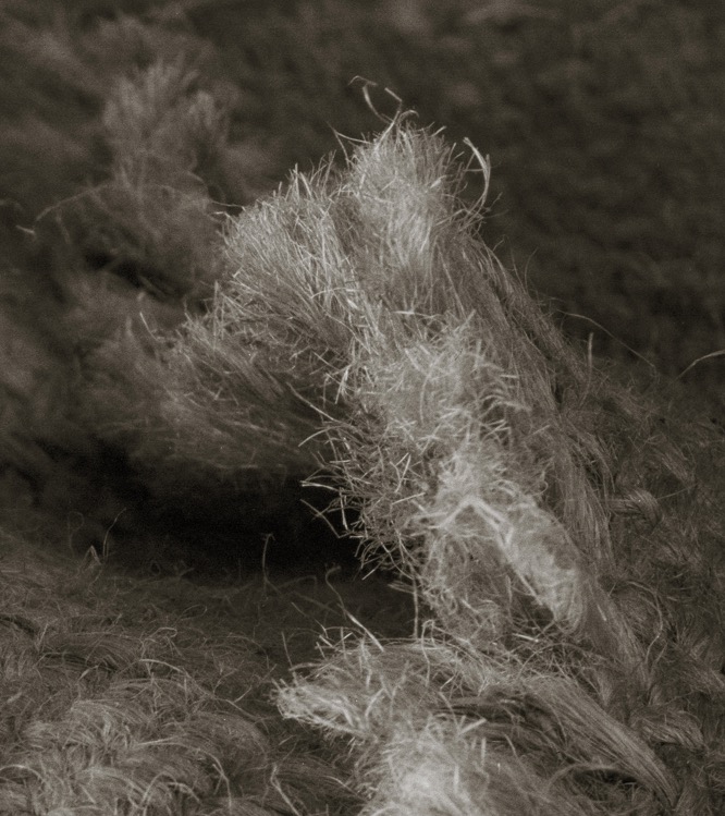
The image below “Out of the Sack” is from my “Afterglow” project. The same 4×5 negative was scanned two ways: (1) Epson V700, undermount, wet mount technique, 4000 dpi using VueScan™ and (2) Howtek™ 4500 drum scanner at 4000 ppi and a 6 micron aperture using DPL™ software. Both resulting scans produced negatives in the 320 MP range, which means printing them at 300 dpi makes a print around 60 x 48 inches.
The small white rectangle represents an approximate 2″ wide section of the large 60 x 48″ print. We’re going to look at this section in detail to compare the V700 to the Howtek scan.
Rectangle shows area of interest for comparing V700 flatbed and Howtek 4500 drum scans.11 inch wide section of the 60×48″ print, showing the delicate fine details and textures in the burlap fringe around the area of interest.
Remember the 2″ wide area of interest is a very small section of the 60×48″ print, but is still large enough to elicit a sense of fine texture and detail in someone viewing the photograph on a wall.. But in a 30×24 ” print, the area of interest would be 1″ wide, and in a 15 x 12 ” print, 0.5″ wide. And at some smaller print size, you’d need a loupe to see those same details and texture.
This is important, because any difference in quality between the two scans will be diminished merely because of the size of the print, regardless of viewing distance. As the print gets smaller, the relative significance of any small section of the print also diminishes. So if you routinely print no larger than say, 16×20 inches, the conclusions I draw from this experiment will have far less importance than I draw from the large reference photograph.
Let’s see how the V700 and Howtek compare in a real-world scenario.
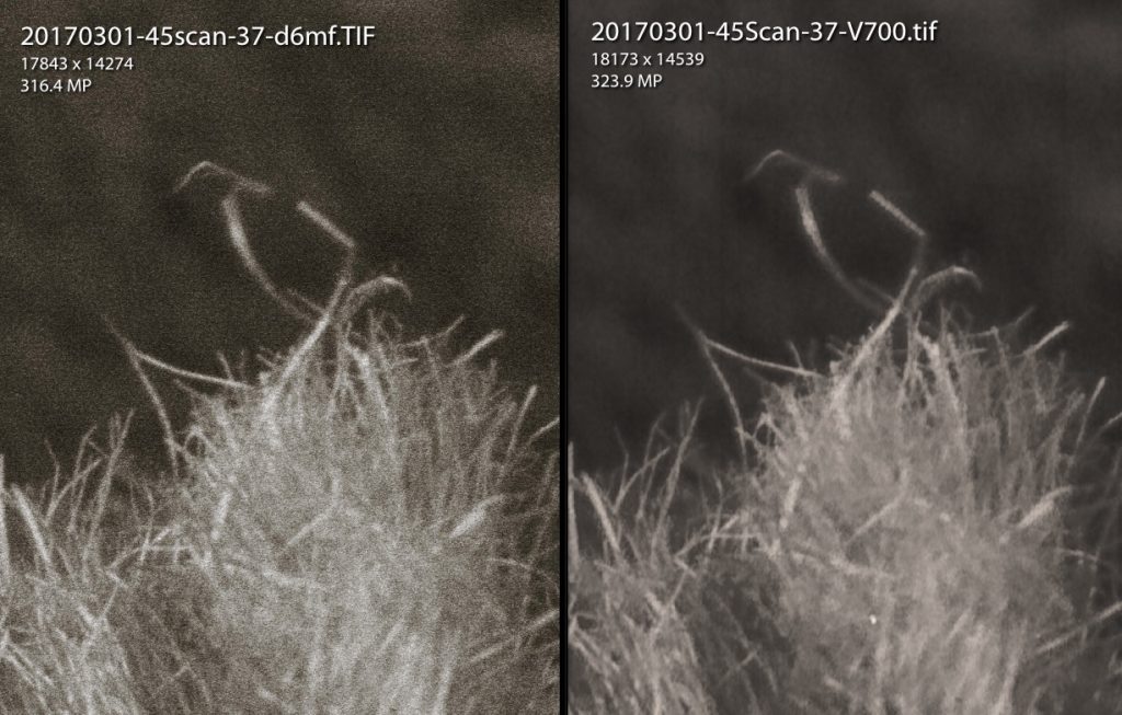
The images below are 1:1 depictions of the small rectangle in the image above (i.e., the area of interest). On the left is the drum scan (Howtek 4500) and on the right is the flatbed (Epson V700). Neither image has been sharpened. Which is “better?”
First, there are differences between the drum scan and the unsharpened flatbed scan. Resolving power of the Epson V700 is very, very close to that of the Howtek 4500. Almost every element (lines, shapes, tones) in the image can be found in both scans. To assess resolution I like to look at lines that create a “V” pattern (or intersectional angles) and at parallel lines that create a line of shadow between them. You can see that almost 95% of such patterns appear in both, in both highlight tones and shadow tones. There are only a small number of very insignificant angles and inter-line shadows that can’t be found in the V700 scan. This indicates that resolving power in the V700 is very close to the Howtek drum scanner.
Second, the main difference between the drum scan and the flatbed scan appears to be due to the higher acuity possible in the drum scanner. All edges are just a bit sharper on the drum scan, giving the appearance of higher resolution, but in fact it is not. Acuity can be best enhanced by sharpening the image (but remember, excessive sharpening can also degrade resolution).
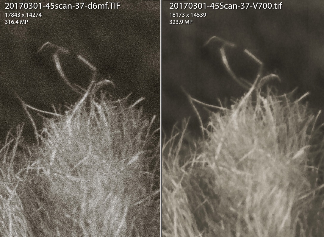
The next image permits side-by-side comparison between the unsharpened drum scan (Howtek 4500) and the V700 scanned image slightly sharpened in Lightroom. Which is “better?”
Indeed, a slight degree of sharpening to the V700 scan improves, but does not equal, the acuity of the drum scan. But it comes really, really close. The settings I used to sharpen the V700 image in Lightroom were Amt 91, Radius 2.0, Detail 33, and Masking 94. This is a small degree of sharpening on a 320 MP image.
What do these comparisons tell us?
My results are not inconsistent with those reported by others. They did the same thing (perhaps not as definitively as I have) showing the differences in image quality between a highly magnified portion of a image when scanned with a flatbed scanner and with a drum scanner. The drum scanner always looks ‘better’ than the flatbed scanner.
I’ve gone one step beyond and showed that the V700 appears to resolve details almost as well as the Howtek 4500 drum scanner, but the V700 suffers a bit in obtaining the same level of acuity. Luckily, minor lapses in acuity can be nearly corrected by careful sharpening.
So, let’s put all this in context again. We began with a scan of a 4×5 ” negative that would produce a 60 x 48 ” print when printed at 300 dpi. 300 dpi is above the 240 dpi below which most healthy human eyes begin to detect a loss of resolution. I showed that the V700 (using my undermount wetmount workflow using Vuescan can resolve nearly all the detail resolved by the Howtek, but that minor sharpening of the V700 image is required to produce nearly all the acuity provided in the unsharpened Howtek scan. This is actually pretty remarkable.
Is the difference between the Howtek and V700 acuity important enough to warrant the extra cost of a drum scan? To answer that, you’d need to ask:
Could your eyes detect the difference I’ve shown if you were to closely inspect a 2″ wide section of a 60 x 48 ” print and say “..that’s not as good as it could be.” You’d not have the benefit of having a drum scanned print as a comparator as we’ve done here. So I’d hazard a guess that most would not be able to detect that small difference.
Do you routinely produce prints that are over 12x linear enlargements of your negatives, as used in this example? If so, you may need to eake out every bit of resolution and acuity that only a drum scanner can provide. Having said that, I’ve created many exquisite, fine prints to 40 x 32 ” from 120 size negatives, a linear enlargement factor of around 15x.
Do you produce high-quality negatives having sharp subjects? If sharpness (i.e., resolution + acuity) isn’t a consideration in your final prints, then it won’t matter during scanning either.
Do you know how to get the most out of your flatbed scanner? I’ve written several articles about scanning with the Epson V700 to maximize image quality as well as several other articles about the Craft of Photography. You may enjoy reading them.
So, do you need to drum scan your negatives?
The short answer is “it depends on the size of the negative and the size of the prints to be made from that negative.” For most of us shooting 35mm film and printing to not larger than 16×20 inches, a high quality, 4000 ppi scan from a modern flatbed scanner could make an exceptional print. But you’ll need every bit of scanning power to make a quality print larger than 16 x 20 inches, and that may mean investing in a drum scan. This also assumes a perfectly sharp, full crop negative from which you take the scan, of course. Still, you will be limited in print size: even drum scanning will not likely get much beyond 18×24 inch fine print from perfect 35mm negative. If you want large fine prints, you need to start with large negatives.
Update 6/23/20:
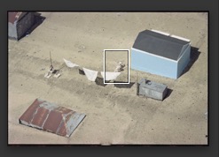
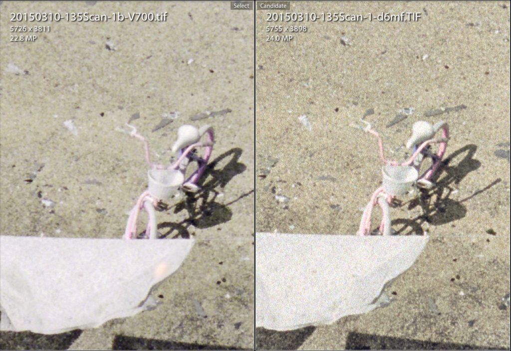
Some of you have asked for a 35mm comparison as I’ve done above for a 4×5 negative. I don’t have many as I rarely shoot 35mm, but I can offer one example. The first image is the complete 35mm frame showing an inset box, from which I then show a 1:1 view of a small pink bicycle on a roof top, first from a V700 Scan and then from a drum scan. Both were sized to 4000 dpi (~24mp) and under a wet mount protocol. Both images were sharpened optimally (and modestly).
Full frame of a 35mm negativeThe left frame is a 1:1 view of a 24mp image scanned with the Epson V700 at 4000 dpi. The right is from the same negative, but scanned using the Howtek 4500 drum scanner.
You’ll probably agree that there are noticeable differences in both acuity and resolution comparing the flatbed with the drum scans in the 35mm format. Keep in mind this is approximately what you would see in an 18.5 x 13 inch full-frame print (printed at 300 dpi). The differences would be less detectable in smaller prints, to a point where you’d need a magnifying loupe to see them.
End of Update
Since I have both my own drum scanner and a good flatbed scanner, which do I use for my final scans of my larger format negatives? Well, I tend to be a perfectionist and I know the drum scanner can get me closer to perfection, so I use my drum scanner for final production, especially for my larger prints for exhibition. But I have no qualms about relying on my Epson V700 for all pre-production proofs, book images, or anytime the expected print sizes are less than 40×32″ or so, depending on negative size..
Today’s modern flatbed scanners are really quite good once you’ve mastered their capabilities. The linear CCD sensors used in these printers will likely never compare exactly to the PMT sensors of the drum scanners of yesterday, but who knows? As the PMT machines become more rare, they may become completely obsolete. While we have them, they definitely have their place in creating the highest quality of images in large prints. For small prints, especially from larger negatives, the cost of getting a drum scan is probably not worth it.
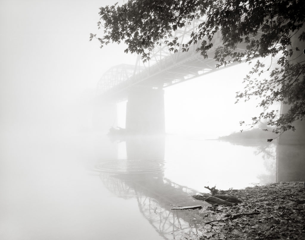
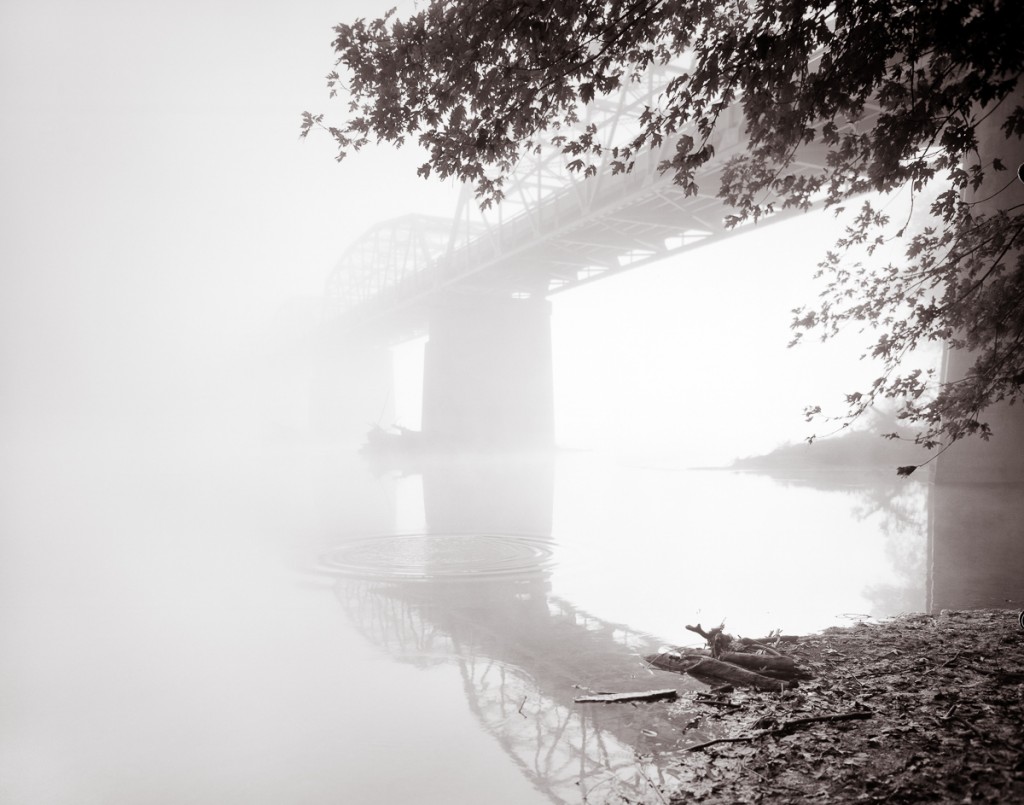
“Bridge to NoWhere” –Heavy morning fog on the Potomac River adds mystery to this otherwise peaceful water scene.
I want to share something that you may take for granted, or perhaps never even thought about, and that is “..where do art titles come from?”
As art lovers, we’re accustomed to seeing titles on artworks. Titles are a convenient way to refer to a particular painting or photograph. So instead of saying “that photograph by Gurski of the Rhine River that someone bought for $4,200,000” we simply know it as “Rhine II.”
Photography lends itself very well to titling of images using nominal or geographic descriptors. That’s the tradition of photography. Whether it’s Weston’s “Pepper” series or any number of Ansel Adams’ titles (“Half Dome,” “Snake River”), or even Gurski’s “Rhine II.” The title of the image often reveals the name of the subject itself, no question about it, just call it what it is.
I find such an objective approach to titling photographs a bit lacking. When I stand before a scene in the field, I try to think about the concept I want to communicate, the story the scene is telling me. It is this story that I want the title to describe and not so much the physical entity in the picture. The title I give to a finished photograph often reflects the story that struck me at the time of capture. In fact, I often write the “working title” on the field log I keep for every picture I take.
For me, it’s important to title my photographs this way. It helps me recall how I felt when I discovered the scene, and it helps me know how I want to interpret the picture to extend and clarify that feeling.
“Bridge to NoWhere” is a good example. This historic bridge over the Potomac River completely disappeared into the heavy fog on this particular morning. The far end of the bridge and the far river bank had completely lost all identity, at least in this story. In reality, I knew where the bridge went, but a title such as “Point of Rocks Bridge over the Potomac River” wouldn’t have communicated the mysterious nature of events that I saw when under the darkcloth.
Every artist has their own way of titling their artworks, and none of them are wrong. I have to admit, though, that when I see a piece of art titled “Untitled,” …well, I just don’t get that. Regardless, whatever the artist has named a particular scene, don’t let it keep you from dreaming up your own story. It’s your fantasy, so write it however you want!
Every picture tells a story. Sometimes it’s a story well-told, and sometimes not.
Just as a writer carefully maps out the setting, the plot, and cast of characters long before he/she begins typing a novel, visual story-tellers–those who make images instead of books–also will previsualize the story they want an image to tell. Previsualization begins when we find or stage a subject that we believe has inherent artistic potential–i.e., has a story to tell–and leads to a point in time when we actually act on that belief by taking its picture or beginning to sketch on canvas.
In photography, previsualization is no less important than it is to any method of image-making. Often our eye will catch something we think has promise, but then we must exercise thoughtful previsualization to make the most of the story in front of us. In fact, previsualization must start with the story we want to tell, and all other compositional decisions we make should support that story.
One of the most important compositional decisions a photographer makes during previsualization is whether the final image will be in color or in B&W.
One good reason to decide on B&W film capture is the creative flexibility that B&W film lends to the photographer. If I can exploit this flexibility, I want to do that. Use of color subtraction filters and the ability to adjust film development to increase or decrease the contrast of the captured image are both good reasons to select B&W film over color film. Color film offers far fewer, if any, creative controls.
But first and foremost, the choice to use either color or B&W film should be based on the scene in front of the camera and what the photographer wants to say about that scene. In other words, does the presence of color support, or does it detract, from the story you want this scene to communicate? This is a question that is just as applicable to digital capture as it is to film capture, and it should be asked during previsualization.
It is so easy to defer the question of “color or B&W?” when shooting in color only, such as when shooting with a digital camera. Since the digital camera always captures the full color spectrum, the tendency is to just capture the scene and worry about converting to B&W later and see which, color or B&W, “looks best.”
This could be a mistake, regardless of whether you’re capturing to a digital sensor or onto film. The reason it’s a mistake is because you’ve also deferred the critical question: “Does my concept for this scene–i.e., the story I want to tell– require color? Does the color in the scene support or does it detract from that story?” When shooting film specifically, deferring this question until later also means that by choosing to use color film, you have removed any opportunity to exploit the creative advantages that B&W film offers.
I follow the advice of the greats who came before me and try to nail down the story for every photograph I take long before I load the film into my camera and click the shutter. Nailing down the story is the first, and perhaps the most important, part of previsualization. The story not only affects the choice of color vs B&W, but also where to point the camera, choice of lens, and every other aspect of composition. I repeat, being in color or being in B&W is one of the strongest compositional decisions to make: it should be made during previsualization. You should know before you take the picture whether it should be B&W or color.
Deciding on color or B&W is an intuitive decision, and I admit that sometimes, I don’t trust my intuition and will capture the same scene onto both color film and B&W film. Most of the time, I learn that I should trust my intuition more.
Here’s a case in point:
I came upon this massive mushroom this week while out walking on a local farm. It was more than 2 feet in diameter and rested in a bed of clover just at the base of an old dead tree stump.
What was immediately obvious was just how obvious this old mushroom was. It’s size and texture of course made it stand out from everything around it, but it’s color was intense as well. The yellow and orange hues really made it ‘different’ from the cooler greens of the surrounding grass and ivy, and from the old monochromatic stump. The impression I had, and this became my concept for this scene, was “Being Obvious.”
From that point on, my single goal in taking its portrait was to support the concept of ‘being obvious.’ My intuition told me that it should be a B&W portrait, and by using a pale yellow filter I could enhance separation of the main subject from its surrounding cooler tones quite well. But its mushroom’s color was so intense that I began an inner argument with myself (i.e., with my intuition) that then caused me to take the portrait in both color and in B&W. Both portraits were taken in similar, flat overcast light.
The color portrait is interesting because of the subject, but I think it lacks balance, and the colors present in the scene seem to detract from the story of the mushroom “being obvious. The intense yellow/orange of the mushroom tends to share the space almost equally with the other two major colors: the blue green ivy and the brown stump. In other words, the natural colors didn’t support my concept very well, even though intense.
I was glad I followed my first inclination and also took the mushroom’s portrait using B&W film. I chose to use a light yellow filter to deepen the tones of the cool green clover and lighten the tones of the fungus, thus exploiting the creative controls possible with B&W film.
“Being Obvious” copyright 2015, J. Riley Stewart
The B&W portrait better segregates the mushroom from all other elements in the image; the ivy and stump are no longer competing for attention with the mushroom, and this change better supports my ‘being obvious’ story. The B&W image also is better balanced than the color portrait, as I was easily able to lighten the tones on the far right of the frame to create that balance. Brightening the same green ivy in the color photograph would not have accomplished the same result.
Had I not previsualized this scene and just took the pretty picture of the mushroom without thinking, I might not have even thought to “see” this in monochromatic B&W, and would have failed to tell the best story for this fantastic, and worthy, subject.
Which do you prefer? Does this picture say something different to you? Would you have captured this portrait in color or B&W?
Update Oct 2019: I wrote the article below in 2012, and much has changed in the digital photography realm since then. Unfortunately, much has stayed the same. First, hi-end digital camera resolution has improved greatly, and has surpassed 35mm film captures. But that has very little to do with art photography. Second, processing software now enables anyone with a digital image to ‘stitch’ captures and make huge digital files capable of huge prints. But that also has very little to do with art photography. Third, we now have very good graduated filters that help manage the luminance range of landscape scenes to accommodate the (still) limited dynamic range (DR) of digital cameras. I have nothing critical to say about DR management filters; I never use them; never need them with my analog workflow.
But the biggest change in digital photography has been, in my opinion, that many digital photographers have learned how to create magnificent images from digital cameras. There are more photographic artists who have converted from analog to digital and forced themselves to learn how to use the digital tool, and they’ve done it very very well.
Article from 2012..
I was recently talking with a friend about digital photography. As we discussed the differences between digital capture and film capture, I blurted “..I think digital photography is the worse thing that could have happened to photography as art.”
The conversation went on, “blah, blah, blah…” and we finally went on about our business. Later, however, I thought “why did I say that? Did I really mean it?”
Those of you who follow my blog know I consider myself to be among the shrinking class of photographers who still use film primarily. I use my Nikon D200 digital camera for some things, but if I’m taking a picture of something I think is important, I’ll use my Nikon F5, my Mamiya RB67 medium format (film) camera, or my Cambo 4×5.
“Purple Mountains Majesty” Captured using a Mamiya RB67 Pro S camera onto Kodak Portra 120 size film and scanned using an Epson V700 film scanner.
But back to my topic: why did I say such a terrible thing about digital photography? Here’s a list of serious consequences that I think represent the downside to the digital revolution; you be the judge how important they are to the art of photography as you practice it.
First a caviat: I consider photography to be the technique of creating an image that depends on light reflecting off a physical entity(ies), striking a light sensitive surface, and thus creating a 2-dimensional representation of that physical entity. Significant manipulation of the 2D representation after capture can cause a departure from photography and into digital art (each artist defines his/her own limits in this regard.) While digital art may use a camera as a tool to create such art, I do not consider digital art and photography to be synonymous.
My other bias is that I also have a personal dislike for what we used to call “chalk and soot” in fine art images. These are large spaces in a photograph that are devoid of any detail in the shadows (soot) or in the highlights (chalk). In either case, such artifacts become distractions because our brain sees them as “unbelievable.” If you’re creating landscape photographs that have distractions, and there are many types, it will discourage many viewers from further engaging in the image. In digital terms, “chalk and soot” is the same thing at “clipping” at the extremes of the light spectrum.
So, here’s my list of reasons why I think digital technology, as applied to photography, has destroyed the art of photography:
1.Tiny, low resolution pictures are the norm. There was a time when most pictures we saw were at least 4×6 inch prints; and commonly 8×10 (the size of a magazine cover) and larger, and printed at 300 dots per inch or greater. The norm today is 3×3 (or less) shown on an excessively contrasty monitor showing us much lower resolutions of 76 dpi.
I believe one of the great human values that photography provides is the opportunity to see and explore real, factual subjects with much greater depth than is possible in the ‘blink of an eye.’ Studying a low-resolution 3×3 inch thumbnail on our display monitors is just, well, impossible. It’s a superficial study at best, and therefore misses the whole point of the value of photography in our lives. While many photographers who post images to the internet exceed 3×3 inch (thankfully), resolution is still largely limited by the display technology. To really see an image for what it is, you need to see it in print, big, and in Hi-Def.
2.It’s not about getting good pictures now, it’s about getting fast pictures. There was a time when most people who took pictures truly wanted the picture to be “good.” Sadly, the norm today is to snap the damn thing, get it up on Facebook to share, and don’t worry about fuzziness, poor lighting, distracting objects, etc. It’s fun to share, but the ease of taking pictures today that don’t cost a dime has certainly reduced incentives to ‘make a good photograph.’ If you want to see an example of my point, just scan a few Facebook galleries of your friends. I’ll bet you’ll agree with me that the vast majority are really bad photographs (but we’ll never say that in public; nor should we I guess.)
3.With a digital camera, “this is the best I can do”. There was a time when skilled photographers took great care to avoid distracting artifacts in their imagery. Proper exposure, proper placement of the camera, and proper selection of camera and lens were fundamental considerations any serious photographer made for every click of the shutter. Today it’s common to see artifacts such as distracting, featureless blacks and pure blown-out whites, fuzziness, photographic noise, and others that are typical with digital capture, even from experienced, well-known photographers. This is, perhaps, my biggest gripe: that serious photographers seem to have compromised photographic quality for ease in ‘picture taking.’ Some say digital is the form that today’s photographic art has taken. And based on the popularity of digital cameras over film cameras, perhaps they’re right…. but I hope not.
4. Digital is a plastic technology. Digital photography is very “digital.” Our eyes don’t see things in digital format, they see things in analog format. So does film, by the way, it responds to light in analog form. WIth digital image capture we get super crisp lines and sharp transitions between colors. Perhaps the best way of characterizing this effect is “plastic.” Yet our eyes see and interpret lines and colors having smooth transitions. If you want to produce images that most closely mimic what our eyes and brains see, you must capture the subject using an analog technology, not a digital one.
This list is a start. While digital technology has given us the ability to take and share pictures so much more easily than before (and this is a good thing, much like the Kodak Brownie introduction in 1888), digital’s popular adoption for fine art photography, and especially for landscape photography, has so far been overwhelmingly bad. As the technology develops further it may overcome its present limitations for capturing subjects having wide latitude, with minimal noise, and excessive “plastic” character.
Most people who take pictures use them just as they come out of the camera. But this is rarely the case with photographic artists. Artists may spend hours on the best images to transform the image provided by the camera into an image that meets their own artistic vision of the scene: this is the creative phase in photography. In this regard, the photographic artist differs from artists who use paints or charcoal only in the medium used to fix the subject within a defined frame.
The creative approaches used by photographers during the creative phase–that phase in which the artists exercises the most artistic freedom– vary greatly. While one artist might limit his/her manipulation of the image to adjusting the lighting to create a more dramatic effect, another might take that same scene and compile it with several other images to create a ‘scene’ that departs drastically from what the camera saw; in fact drastically departing from reality. Jerry Uelsman was among those who exaggerated that definition by merging various photographs to create composite images. He became quite famous doing this (see http://www.uelsmann.net/).
Photography has been traditionally a documentary technology used to capture on film an image produced by light waves emanating from a scene in front of a lens. Because of this documentary aspect of photography, most people today still believe, and expect, that a photographic image is essentially a factual representation of an actual scene, setting, subject, or incident. When you ask the the man on the street whether a picture is “real,” they will tell you that it is unless it obviously isn’t (such as the proverbial rabbit head on the body of a moose or the beautiful but fantastical composites by Uelsmann).
In the digital camera age using photo editing software, it’s a simple matter to overlay 2, 3, or 16 different camera shots into one “photograph.” Whether it’s Uelsman’s merging of several negatives or a modern digital photographer’s merging several digital files, the essence of fact that distinguishes photography as a documentary technology can be completely lost. So my question is.. “When does artistic freedom begin to contradict the fundamental definition of photography?” If compositing multiple images isn’t photography, then what is it?
When it comes to artistic freedom in general, I say “to each his/her own.” But that’s not my opinion when it comes to defining photographs. Photographs should be kept a pure art form. I think that every pixel (or grain of silver) should represent a wave of light that entered the camera and struck the sensor/film at the time of capture of the subject or scene.
Artists who paint or draw can put whatever feature(s) they want on the pallet before them and no one questions it because no one accepts a painting as representing reality: we all know it’s the artist’s imagination that we see on the canvas. I believe those who do the same using photographic images aren’t photographers, but they are artists, still. But what do we call this if not photography? Perhaps it’s more precisely an illustration.
Why should this matter to the fine art community and to photographers specifically? Because if we continue to merge multiple photographs into one image and still call it a photograph, then the art form we know as photography will revert to a tool no different than the paintbrush, spatula, or pencil in the hands of a skilled realist. Photography will have no distinction as an art form itself because it will not longer have a distinctive “form.” In fact, fine art photography may cease to exist. Beautiful vistas of the Grand Canyon will no longer be credible (“was that ridge really in the scene or did the photographer merely put it there?”). We’ll know this has happened when our viewing public expects that an image has been “photoshopped,” whether it has or hasn’t.
Where should photography draw the line regarding artistic freedom in image manipulation?
My opinion is that as long as the image doesn’t contain a physical entity that wasn’t there when the shutter was clicked, it’s a photograph. So putting a boat into a picture of a mountain lake, when that boat wasn’t there at the time the mountain lake was captured is not photography. But enhancing lighting by dodging and burning or setting levels, cropping, or enhancing colors, none of these change the content of the photograph as it was captured, and thus remains a valid documentation of light hitting the film (or sensor) when the shutter was clicked.
I’m certain this opinion will be hotly debated..I’m not the first to raise it as an issue for our times. What do you think… are then ANY bounds is how we define photography today? When does a photographer stop being a photographer and start being an illustrator? Do we owe it to our art public to keep photography ‘real?”
As a developing photographer, I found it very difficult to find advanced lessons in color theory, composition, and artistic design related to the art of photography. EVERYBODY seems to want to talk about photography gear…cameras, lenses, software, etc., etc. Likewise, articles and books that discuss the basics of photographing are abundant. But once you’ve grasped the basics, where does a photographer turn to learn the advanced techniques so critical to becoming an accomplished fine art photographer??
I’ve mentioned before that I’m not formally trained… what I know I learned from other photographers/artists and by experimentation with my own work. Lots of experimentation.
I decided some time ago that I wasn’t going to find what I needed to know about ‘what makes a great fine art photograph‘ by reading photography magazines and photography web sites (a few exceptions aside). So now I spend more time reading blogs and newsletters that cater to fine art painters than I do to those that cater to photographers. I’ve found I can learn a lot from advanced artists, regardless of which tools they use to express their art.
From painters: neutral whites and grays, being devoid of color (by definition), typically fail to add anything to a colorful presentation of a landscape scene, a bowl of fruit, or even a portrait. In real life, shadows are rarely dark neutral gray or pure black and whites are rarely neutral light gray or pure white–shadows and highlights are affected by surrounding colors. Painters think about the various hues (colors) and values (‘lightness’) that their shadows and highlights must have to produce the intended emotion in their paintings before they even paint the first brush stroke.
What can we photographers learn from this? After all, this appears to conflict with the common, albeit important, basic rule of photography to white balance our photographs to reduce tinting artifacts that might appear otherwise. Unless intended for artistic reasons, a tinted photograph will more likely be accepted as distracting/disturbing instead of pleasing.
So we all white balance our photographs. And the way we do this is to find a subject in our image that “should” be without color, and remove all color from that subject, which then removes the same color globally from the image. This makes everything balanced colorwise. Whites are neutral white and grays are neutral gray, just as they should be, right?
Well…..sometimes this is right, but it may come at a cost to your creation. As fine art artists, we need to consider color confluence as Lori describes in her article. I do, and have for a long time, so let me describe how I approach this lesson with an example.
Morning light is typically warm on the landscape, and shadows are deep and cool (meaning they don’t get much of the direct warm sunlight). Under these conditions, there is no single best white balance…any setting you use will compromise the other end of the spectrum. So balancing on the cloud tops produced the resulting image below. It is generally cold, comprised largely of cyan and blue green, with just a weak hint of the warm sunlight that inspired me to capture the image in the first place.
As photographers, we should to be aware that rarely are shadows and whites truly neutral in the environment. Neutral subjects pick up the colors of surrounding articles, even sky. We can create images of much greater impact and beauty if we exploit this lesson. Let’s not be victim to the dumb white balance algorithms in our cameras/ scanners.
The other lesson I want to return to is that fine art photography is, in fact, art. I continue to learn more about creating art from fine art painters as I do from fine art photographers. Go where the lessons are, and your photography will reap the benefits.
If you enjoyed this article, please let me know by creating a comment and ‘liking” my FB page here:
By continuing to use the site, you agree to the use of cookies. Thank you. more information
The cookie settings on this website are set to "allow cookies" to give you the best browsing experience possible. If you continue to use this website without changing your cookie settings or you click "Accept" below then you are consenting to this.


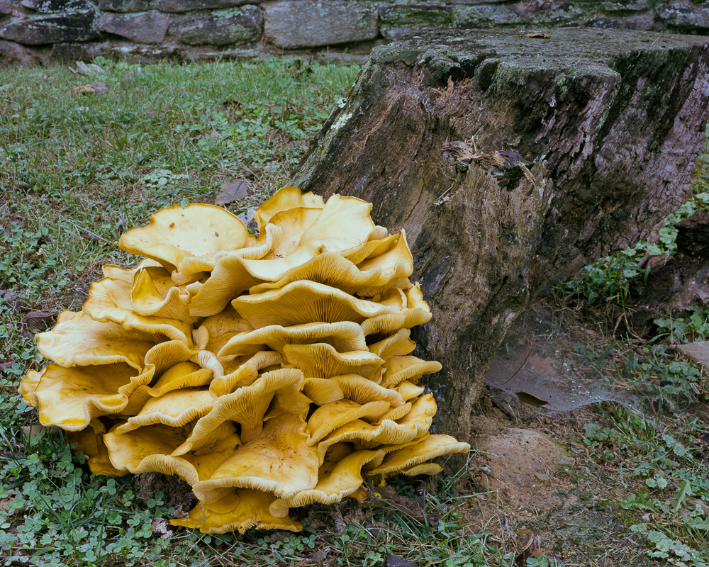 I came upon this massive mushroom this week while out walking on a local farm. It was more than 2 feet in diameter and rested in a bed of clover just at the base of an old dead tree stump.
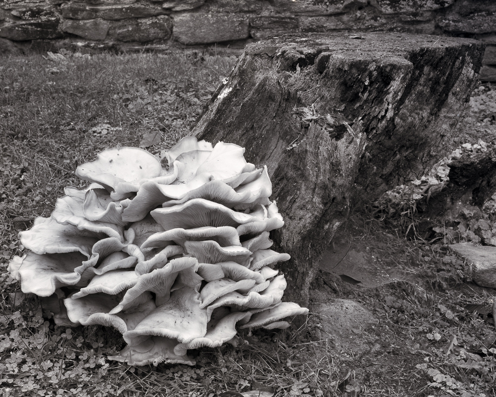
