What makes a photograph “original,” and why does it matter?

Example of provenance COA stamp on reverse of a J Riley Stewart limited edition print
Authentication establishes provenance to an original photograph.

Establishing provenance for fine art photography is just as important as provenance for paintings and other hand-crafted visual artworks. Let me tell you why and how to determine if a photographic print is original.

I recently read a story about a gallery customer who bought an Ansel Adams photograph on the cheap ($6). He was elated, believing it to be an original. But, when he later discovered it was merely a cheap reproduction from a calendar, he felt cheated. You can read about it here:  http://petapixel.com/2014/10/07/print-scam-meets-eye-ansel-adams-gallery/   

This buyer isn’t the first–and he won’t be the last–to be confused about the definition of “original photograph.”  With a little bit of knowledge, and understanding the terms used to describe art originality, you will be a smarter collector.

It’s fairly easy to identify an original oil painting. You can actually see the paint on the canvas.  It’s not so easy to tell original watercolors or illustrations from their reproductions. Printing materials today are so good that, without advanced inspection, a reproduction of a watercolor or illustration can look very much like an original. 

Fortunately, when painters and illustrators sell printed copies of their artwork, they usually mark them as “reproduction.” Reproductions are made using a variety of mass printing processes, such as digital inkjet or lithographic printing.  Anytime you see contemporary wall art marked as a reproduction, you’re looking at a mechanically printed digital picture of the original handcrafted artwork, and there may have been thousands of copies made. Because of this, reproduction prints are much less expensive than the original artwork. 

Well, if digital prints of paintings are considered reproductions, why aren’t all prints considered reproductions? Aren’t modern inkjet photographic prints just copies of a digital image?   

It’s true that today the vast majority of photographic prints are created using mechanical printers. And the number of copies is virtually limitless with today’s printing capabilities. This situation makes defining “original photograph” much more useful today compared to the times when photographers made “copies” in very small numbers and when each print was hand made from an original piece of film. 

Uniqueness has never been a strict criterion for describing art as original. A painter or illustrator can create the same scene again and again, a songwriter can record the same song again and again, and a photographer can print her photograph again and again. Art need not be “one-of-a-kind” to be original.

There is, however, one attribute that all artwork must have to be universally recognized as original:  provenance. This includes all visual artistic media, even art photographs.

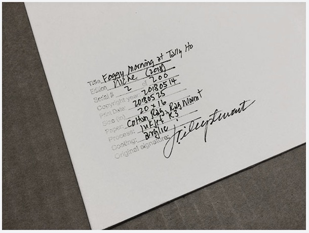
Provenance is a set of facts that inextricably link the physical object of art to its creator. Provenance describes the artwork explicitly, disclosing its title, the name of the artist, the date of creation, its medium, and its dimensions, at the very least.  The medium will indicate whether the artwork is an oil painting, a bronze statue, or a photograph. When you see provenance on a label or caption, you can be fairly confident that the physical object is authentic to the named artist. When you don’t see provenance, it either means the artist neglected to document his/her creation or that it’s a reproduction or a forgery, none of which is good for you as a collector.

Original photographs, i.e., those with provenance, carry another descriptor that isn’t as commonly used in handcrafted art: the copyright status at the time of creation. The creator of any artwork is always the first owner of the copyright. Copyright ownership is especially important to the provenance of original art produced through a printing process like photography, digital art, printmaking, stories, and songs, where copyright status is almost always cited in the provenance. 

Like paintings, the opposite of an original photograph is a forged photograph. Today it’s fairly easy to download someone else’s photograph from the web, run it though editing software, print, sign it, and then frame it for personal or commercial use. Clearly, when someone claims someone else’s photograph as their own, that photograph is not an original. It’s a forgery.  Of course, this violates the law, but it can and does happen. Should a buyer of a forgery expect to pay the same price as an original? Of course not. Do they?  Sometimes, but only when deceived or uninformed.

Here’s some of the most common ways to determine originality of an photographic print:

  • Original photographic prints will have provenance, including copyright information, typically documented on a Certificate of Authenticity (COA). The COA will be either attached to the photograph itself or in the hands of the gallerist selling the photograph. It should always convey with the photograph upon sale.
  • Know the photographer. Research his/her website, visit their gallery, and communicate with them. They will be happy to discuss a particular piece with you and substantiate it as their own, and tell you when it’s not. A part of being a professional art photographer is documenting provenance for each original work.
  • Read the label. If you see a photographic print labeled as a “reproduction,”  it typically means that the authoring photographer had very little to do with the printing, distribution, and selling of that photograph (either legally or illegally). Ansel Adams himself had nothing to do with the printing and sale of the 2013 calendar print mentioned in my lead paragraph, and the label correctly identified it as a “reproduction.”
  • Finally, give yourself permission to accept that if the photograph looks like it came from low quality printing like a book, poster, or calendar or is priced at $6.99, it is very likely a reproduction.

I take a rather rigid approach to provenance for my own work. My original prints all have a common description: I took the picture and own the copyright, I personally interpreted the scene/subject, I personally printed the photograph using techniques I deliberately chose, and then finished the photograph and documented its serial number in a limited edition. Each of my originals comes with a signed COA, either as an attachment or permanently stamped on the reverse of the print, that should follow the photograph forever.

More about how I manage my limited editions of fine art photographs.

If you collect artwork and care about potential resale value or collectible status, it’s smart to know when you’re collecting originals versus reproductions. You don’t want to pay original prices for reproductions, and if you ever choose to resell your collection, don’t expect someone else to have great interest in your reproductions.

Happy collecting!


See more J. Riley Stewart images.

In image-making, you need to know the story before you can tell it.

Every picture tells a story. Sometimes it’s a story well-told, and sometimes not.

Just as a writer carefully maps out the setting, the plot, and cast of characters long before he/she begins typing a novel, visual story-tellers–those who make images instead of books–also will previsualize the story they want an image to tell.  Previsualization begins when we find or stage a subject that we believe has inherent artistic potential–i.e., has a story to tell–and leads to a point in time when we actually act on that belief by taking its picture or beginning to sketch on canvas.

In photography, previsualization is no less important than it is to any method of image-making. Often our eye will catch something we think has promise, but then we must exercise thoughtful previsualization to make the most of the story in front of us. In fact, previsualization must start with the story we want to tell, and all other compositional decisions we make should support that story.

One of the most important compositional decisions a photographer makes during previsualization is whether the final image will be in color or in B&W.

One good reason to decide on B&W film capture is the creative flexibility that B&W film lends to the photographer. If I can exploit this flexibility, I want to do that. Use of color subtraction filters and the ability to adjust film development to increase or decrease the contrast of the captured image are both good reasons to select B&W film over color film. Color film offers far fewer, if any, creative controls.

But first and foremost, the choice to use either color or B&W film should be based on the scene in front of the camera and what the photographer wants to say about that scene. In other words, does the presence of color support, or does it detract, from the story you want this scene to communicate? This is a question that is just as applicable to digital capture as it is to film capture, and it should be asked during previsualization.

It is so easy to defer the question of “color or B&W?” when shooting in color only, such as when shooting with a digital camera. Since the digital camera always captures the full color spectrum, the tendency is to just capture the scene and worry about converting to B&W later and see which, color or B&W, “looks best.”

This could be a mistake, regardless of whether you’re capturing to a digital sensor or onto film. The reason it’s a mistake is because you’ve also deferred the critical question: “Does my concept for this scene–i.e., the story I want to tell– require color? Does the color in the scene support or does it detract from that story?”  When shooting film specifically, deferring this question until later also means that by choosing to use color film, you have removed any opportunity to exploit the creative advantages that B&W film offers.

I follow the advice of the greats who came before me and try to nail down the story for every photograph I take long before I load the film into my camera and click the shutter. Nailing down the story is the first, and perhaps the most important, part of previsualization. The story not only affects the choice of color vs B&W, but also where to point the camera, choice of lens, and every other aspect of composition. I repeat, being in color or being in B&W is one of the strongest compositional decisions to make: it should be made during previsualization. You should know before you take the picture whether it should be B&W or color.

Deciding on color or B&W is an intuitive decision, and I admit that sometimes, I don’t trust my intuition and will capture the same scene onto both color film and B&W film. Most of the time, I learn that I should trust my intuition more.

Here’s a case in point:

Being Obvious (color)
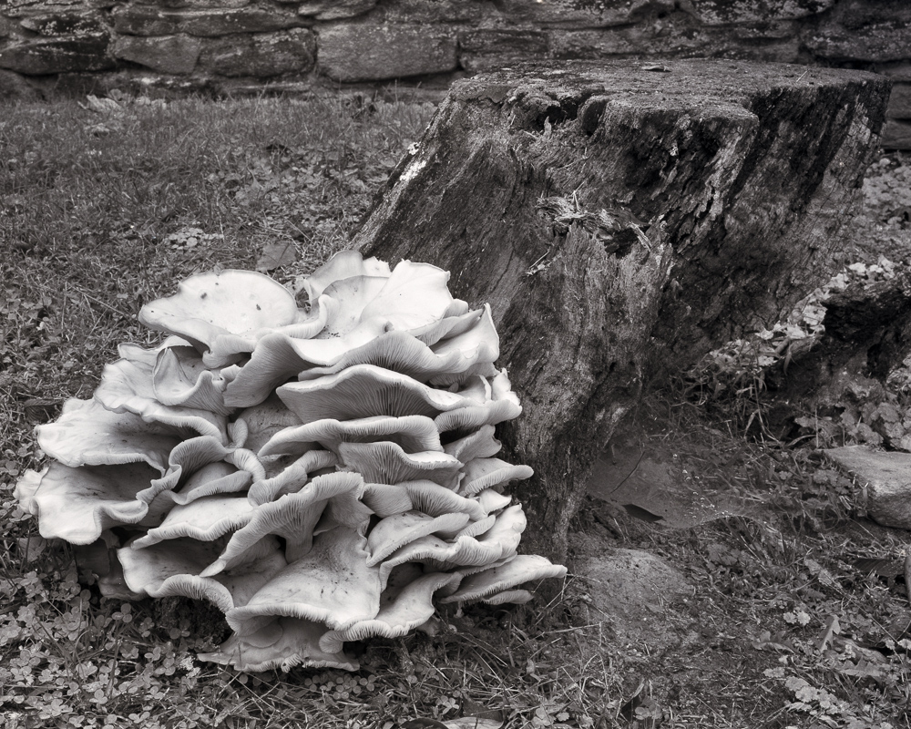
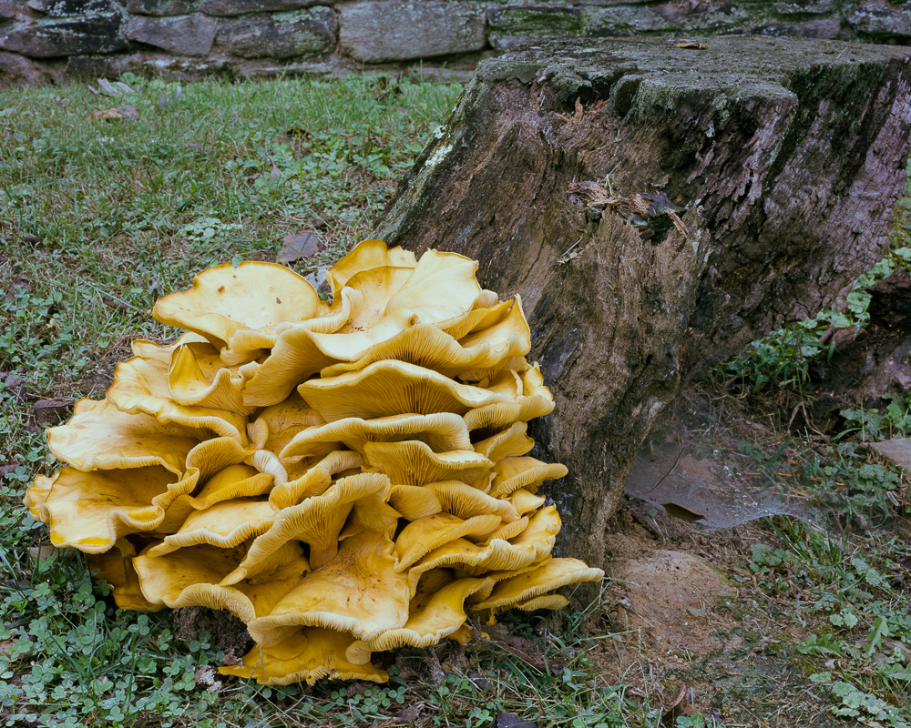
I came upon this massive mushroom this week while out walking on a local farm. It was more than 2 feet in diameter and rested in a bed of clover just at the base of an old dead tree stump.

What was immediately obvious was just how obvious this old mushroom was. It’s size and texture of course made it stand out from everything around it, but it’s color was intense as well. The yellow and orange hues really made it ‘different’ from the cooler greens of the surrounding grass and ivy, and from the old monochromatic stump.  The impression I had, and this became my concept for this scene, was “Being Obvious.”

From that point on, my single goal in taking its portrait was to support the concept of ‘being obvious.’ My intuition told me that it should be a B&W portrait, and by using a pale yellow filter I could enhance separation of the main subject from its surrounding cooler tones quite well. But its mushroom’s color was so intense that I began an inner argument with myself (i.e., with my intuition) that then caused me to take the portrait in both color and in B&W. Both portraits were taken in similar, flat overcast light.

The color portrait is interesting because of the subject, but I think it lacks balance, and the colors present in the scene seem to detract from the story of the mushroom “being obvious. The intense yellow/orange of the mushroom tends to share the space almost equally with the other two major colors: the blue green ivy and the brown stump.  In other words, the natural colors didn’t support my concept very well, even though intense.

I was glad I followed my first inclination and also took the mushroom’s portrait using B&W film. I chose to use a light yellow filter to deepen the tones of the cool green clover and lighten the tones of the fungus, thus exploiting the creative controls possible with B&W film.

Being Obvious
“Being Obvious” copyright 2015, J. Riley Stewart

The B&W portrait better segregates the mushroom from all other elements in the image; the ivy and stump are no longer competing for attention with the mushroom, and this change better supports my ‘being obvious’ story.  The B&W image also is better balanced than the color portrait, as I was easily able to lighten the tones on the far right of the frame to create that balance.  Brightening the same green ivy in the color photograph would not have accomplished the same result.

Had I not previsualized this scene and just took the pretty picture of the mushroom without thinking, I might not have  even thought to “see” this in monochromatic B&W, and would have failed to tell the best story for this fantastic, and worthy, subject.

Which do you prefer? Does this picture say something different to you? Would you have captured this portrait in color or B&W?

Leave a comment below! 

Visiting great places near home

Wherever you live, I’ll bet dollars to donuts that at some point a visitor has asked you “..what’s there to see around here?” After you tell them about the most famous “sight” around, they invariably ask you “Have you been there?” And chances are, you have to say “no.” For some reason, Americans will go out of their way to visit places that require a long drive or short flight. We often overlook those nearby sights that are literally filled with tourists this time of year, all of whom have made long drives or short flights to get there!

MapSince April 2011, I’ve been doing pro-bono photography for a local not-for-profit organization, the Mosby Heritage Area Association (http://www.mosbyheritagearea.org/). This Association promotes the natural and cultural heritage of the Virginia piedmont located in Loudoun County, where I live, and surrounding counties. This has been a boatload of fun, but more than that, it’s encouraged me to spend alot of time exploring parts of Virginia close to my home in Leesburg, but that I had never really explored before. 

High on a typical American photographer’s wish list is to attend workshops at  drop-dead gorgeous places like Yosemite, Yellowstone, Grand Canyon, the Tetons, Death Valley, anywhere in the Utah Mountains, Great Smoky Mountains, Appalachia, and the coasts along of the Atlantic or Pacific Oceans. Notice something?  For most of us, each of these places require a long drive or a short (sometimes not) flight! 

The northern Virginia Piedmont is largely rural and agricultural. It has constantly rolling hills, plentiful rivers and streams, hardwood and pine mixed forests, historical architecture, and lots of animals- domestic and wild. And twice a day– on most days– it has beautiful sunrises and sunsets!  I bet it’s pretty typical of areas close to your own home. Since I like taking landscape photographs, this kind of terrain is ideal as it offers variety to my camera without a lot of complexity. I’m not crazy about complex scenes.

Taken during early evening in rural Fauquier County

I mentioned sunrises and sunsets before. These are my preferred times of the day to photograph landscapes (and they should be yours too). The quality of light is just awesome when the sun is up and within a couple of hours of the horizon. For example, I captured the image above of the deer grazing on Piedmont grasses about 2 hours before sunset. At these times of the day, wild animals are moving around and more visible, the deep shadows provide greater depth in the scene, and the lower intensity of light is more suited to capture by camera. Even when not shooting with a camera, driving around the countryside at or near sunrise and sunset will give you views you’ll never see at mid-day.

This is one of a pair of ornaments placed on the gate posts at the Welbourne House, an antebellum mansion belonging to the Dulaney family.

As you explore an area close to home more fully, you’ll begin to notice its enduring (and endearing) character.  On my recent trips in the Virginia Piedmont, specifically along a 7 mile stretch of US Route 50 west of Middleburg, VA, I noticed something I’d seen nowhere else in Virginia. Many of the farms in this area are large, and entrances are marked with stone gateways. What amazed me was the variety and number of ornaments placed on top of these gateways, which I found fascinating: both from a photographic perspective and from a human perspective. Clearly, some these ornaments are new, but many predate the American Civil War. I began purposefully looking for swans, foxes, eagles, pineapples, roosters, and other pieces of statuary set atop farm gate posts. At some point, I want to research how and why this small area developed this unique character, and that research will encourage me to return time and time again. I’m sure I haven’t discovered them all, yet.

So let me encourage you to get out and explore the sights close to home. Unlike more distant destinations, you can return time after time easily and really get to know the area. And don’t forget your camera!

You can view more images of my ventures into the Virginia piedmont at  Virginia Piedmont Collection


Best regards,

Jim

We can learn a lot from other artists

As a developing photographer, I found it very difficult to find advanced lessons in color theory, composition, and artistic design related to the art of photography.  EVERYBODY seems to want to talk about photography gear…cameras, lenses, software, etc., etc. Likewise, articles and books that discuss the basics of photographing are abundant. But once you’ve grasped the basics, where does a photographer turn to learn the advanced techniques so critical to becoming an accomplished fine art photographer??

I’ve mentioned before that I’m not formally trained… what I know I learned from other photographers/artists and by experimentation with my own work. Lots of experimentation.

I decided some time ago that I wasn’t going to find what I needed to know about ‘what makes a great fine art photograph‘ by reading photography magazines and photography web sites (a few exceptions aside). So now I spend more time reading blogs and newsletters that cater to fine art painters than I do to those that cater to photographers. I’ve found I can learn a lot from advanced artists, regardless of which tools they use to express their art.  

From painters: neutral whites and grays, being devoid of color (by definition), typically fail to add anything to a colorful presentation of a  landscape scene, a bowl of fruit, or even a portrait. In real life, shadows are rarely dark neutral gray or pure black and whites are rarely neutral light gray or pure white–shadows and highlights are affected by surrounding colors. Painters think about the various hues (colors) and values (‘lightness’) that their shadows and highlights must have to produce the intended emotion in their paintings before they even paint the first brush stroke.

What can we photographers learn from this? After all, this appears to conflict with the common, albeit important, basic rule of photography to white balance our photographs to reduce tinting artifacts that might appear otherwise. Unless intended for artistic reasons, a tinted photograph will more likely be accepted as distracting/disturbing instead of pleasing.

So we all white balance our photographs. And the way we do this is to find a subject in our image that “should” be without color, and remove all color from that subject, which then removes the same color globally from the image. This makes everything balanced colorwise. Whites are neutral white and grays are neutral gray, just as they should be, right?

Well…..sometimes this is right, but it may come at a cost to your creation. As fine art artists, we need to consider color confluence as Lori describes in her article. I do, and have for a long time, so let me describe how I approach this lesson with an example.

Morning light is typically warm on the landscape, and shadows are deep and cool (meaning they don’t get much of the direct warm sunlight). Under these conditions, there is no single best white balance…any setting you use will compromise the other end of the spectrum. So balancing on the cloud tops produced the resulting image below. It is generally cold, comprised largely of cyan and blue green, with just a weak hint of the warm sunlight that inspired me to capture the image in the first place.

  As photographers, we should to be aware that rarely are shadows and whites truly neutral in the environment. Neutral subjects pick up the colors of surrounding articles, even sky. We can create images of much greater impact and beauty if we exploit this lesson. Let’s not be victim to the dumb white balance algorithms in our cameras/ scanners.

The other lesson I want to return to is that fine art photography is, in fact,  art. I continue to learn more about creating art from fine art painters as I do from fine art photographers. Go where the lessons are, and your photography will reap the benefits.

If you enjoyed this article, please let me know by creating a comment and ‘liking” my FB page here:

And subscribe to my Free Articles from “Under the Darkcloth” using this link.

Best regards,

Jim