The Psychology and Aesthetics of a Toned Monochrome Print

Color affects our emotions. Whole volumes have been written describing these effects, and how artists and advertisers use color to best induce specific emotions. Color also has profound effects on the perceived depth of any two-dimensional representation of our three-dimensional world.

To make the point, look at the three squares below. Which color, blue or red, seems ‘closer’ to you? This example is a good way to show how our eyes play tricks on us when it comes to color alone. If you see the red square appear to be in front of the blue squares, that is the typical response.  There is a biological explanation for this effect, but the result is that “warm (e.g., red) colors project” and “cool (e.g., blue) colors recede.”

ColorContrast

How does this relate to the psychology of B&W (so called, “monochrome”) prints?

I’ve been creating B&W prints for years, but the truth is, I don’t really care for “black and white” prints. I much prefer “purple and white” or “eggplant and white,” and for some subjects, “brown and white.”

The 20th Century masters of landscape photography touted the physical and emotional effects of toning their B&W prints. There were dozens of techniques and materials used to impart colors selectively to silver gelatin prints. Among the most widely used was a selenium chloride solution. Depending on the paper and developer used to print the image, bathing the print in a weak solution of selenium chloride for a few minutes materially changed the color of the print to what Ansel Adams called an “eggplant” color, most noticeable in the darker shadow areas.

I loved the aesthetic effect selenium toning had on my prints, so it became a standard part of my darkroom workflow, and now continues in my hybrid workflow.

What was that effect?

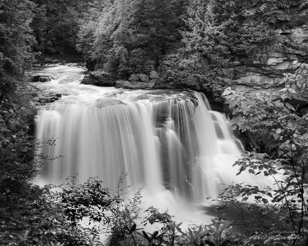
Take a look at the two images below. The first is a straight “monochrome” depiction of Blackwater Falls in West Virginia. It’s a beautiful image, full of light and excitement and depth. These characteristics are imparted solely by the subjects, which are entirely shades of neutral gray (you may see color, but it’s because your monitor is not neutral–most are not). This depiction represents what comes out of the standard B&W developer or when you convert an image to B&W in a digital workflow.

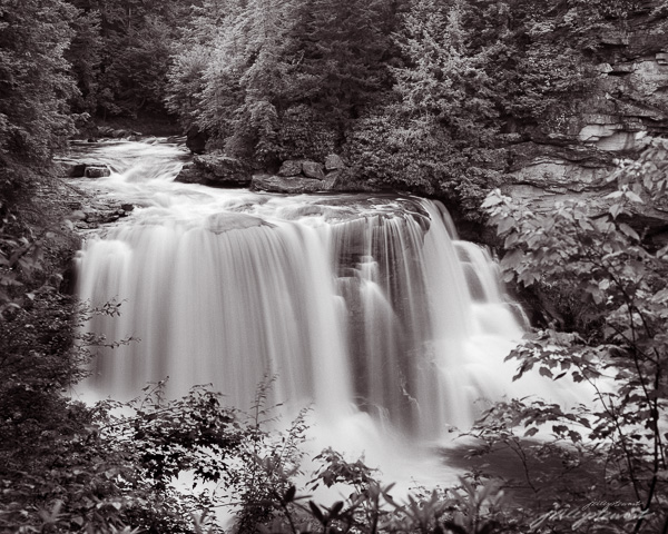
Now look at the second image. It was given a treatment that selectively toned the shadow areas as if the print was toned in my darkroom method for selenium toning. The mid tones and shadow areas now have this deep purple (so called “eggplant”) tone.

Blackwater Falls at Full Force

Blackwater Falls at Full Force
“Blackwater Falls at Full Force” – Limited edition archival pigment print, up to 40×32 inches


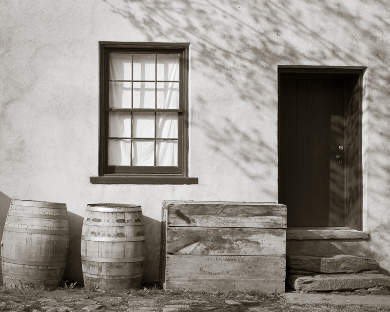
There are many other tones besides the ‘eggplant’ of selenium toner that artists can choose to use. For some images, I like a warmer tone that mimics Kodak Brown Toner I used to use on wet prints made in the darkroom. Brown toner is very effective in giving a more nostalgic aesthetic to some subjects, such as those in my Virginia Grist Project and other old architectural subjects, like “Dappled Shadows” below.

example of a warm-toned print
“Dappled Shadows on a Store Front” – warmer brown tones gives a nostalgic aesthetic to old architectural subjects.

How do you feel about the two different presentations? If the second image appears to have more depth in the shadows, it’s because the cooler purple color appears to recede behind the screen surface; the comparatively warmer whites appear to be in front of the shadows. This therefore tends to push the highlights in the water forward and causes the trees and other shadows to fall back into the image, much like the red and blue squares above, creating a greater sense of depth in the image.  Depth in a two-dimensional picture encourages the viewer to want to engage in the picture, something all visual artists want from our audience.

There is also an emotional aspect to the image I think is important. Hues in the purple range are known to induce a sense of calm and creativity, of wonder and exploration. Purple is a very emotional color to most humans.  The toned image of this enormous waterfall therefore creates an internal conflict that is very subtle, but still there. First, you stand before this potentially dangerous, powerful, noisy waterfall that most of us react to with a bit of anxiety, red flags goes up in your consciousness: beware!  But surrounding the waterfall on all aspects is this calming tone that encourages exploration of the shoreline, the trees, the flowers and rocks along the river’s banks. This is a conceptual contrast, and one I think adds drama and excitement in the toned print that isn’t so apparent in the untoned print.

I always tone my B&W prints, varying between a cooler (more bluish) to a warmer (more reddish) selenium tone, depending on the subject of the photograph. It’s always a very subtle tone, not even as much as I’ve shown you in the second image above, which I exaggerated for purposes of this article.

If you make B&W prints (or even web images), experiment with toning to emphasize the feelings you want to compel in viewers. There is a infinite number of possibilities.  In Lightroom, use the Split Toning feature to do this. For the toned image above, I set the Highlight toning saturation to 0 and the Shadow saturation to 9, hue 354. I set Balance to +50, favoring toning to the shadows.

To my heart, monochrome images should be way more than black and white!

Do you already tone your B&W images? What are your experiences? Let me hear your thoughts.

Cheers!


Varnishing photographic prints as a way to present them distinctively

Varnishing photographic prints on paper is an alternative to showing them matted and placed under glass. There are many benefits to varnishing prints. Let’s go through them.

But first, if you want to get an idea of what we’re talking about, watch this video. There are many ways to varnish prints; this is the technique I use.


Whether printed in a wet darkroom or printed by inkjet, photographic prints require some form of protection to keep them clean and protected. In early days of albumen and platinum paper prints, the old timers would wax the surface and place the prints under a mat, which was then placed under glass.  Waxing prints is an art form in its own way: if you’ve ever tried it you know what I mean.

Today, matting and glazing remains the standard technique to protect and display photographic prints. But there’s a significant aesthetic and physical cost to this presentation.  First, there’s the reflection off the glass that you have to fight before you can actually enjoy the artwork beneath. Second, glass is heavy and adds a lot of weight to the framed artwork. Third, glass is breakable; it needs its own protection for safety sake. Fourth, glazing requires matting; both adds complexity and cost to framing artwork in the traditional way.

Varnishing prints is an excellent alternative to matting and glazing.  A varnished print can be mounted into an open frame without additional protection. The varnish is washable and sufficiently durable to environmental grime or other hazards like sneezes, dirty fingers, or accidental rubs and scrapes.  Compared to traditional presentations, a framed varnished print is much lighter in weight, has no breakable glass to worry about, and requires no matting. Framing a varnished print is much easier and less expensive than framing traditionally.

But these physical benefits of a varnished print are of less importance than the aesthetic benefits, in my opinion. Modern varnishes (which are actually acrylics) gives the surface a subtle semi-gloss sheen but it also deepens the blacks and enhances global contrast and color vibrancy.  I prefer the semi-gloss surface, but know that you can choose any degree of glossiness you prefer, from full matte to very shiny gloss depending on the actual varnish applied. Regardless, from an aesthetic perspective, varnishing enhances a sense of visual depth in the image and gives it a very distinctive and  ‘painterly’ luminism-like appearance. Viewing these prints is a very different experience than viewing traditional matted/glazed prints.


Example of a hand-varnished print surface

Print varnishes are available from several suppliers, but they all are acrylic-based, which are applied in liquid form but which dry to a hard, durable coating after minutes to hours. I use Breathing Color Glamour II Glossy diluted with distilled water (2:1 or so) and only on rag papers. I use BC’s 9″ foam roller approach, but have tried other rollers with a lot of success. (I gave up on ‘any ole roller’ approach after spending 6 months reworking my technique because my hardware store changed their supplier of the rollers I was using, to disastrous effect).

Varnishing is fairly simple to master, but like any other print treatment it may require experimentation and practice. I’ve worked out a method that’s fairly reliable that I’m sharing below.

If you want to try hand-varnishing your photographic prints, here are a few tips from my technique:

1. Use multiple thin coatings of diluted varnish. It helps extend tack time until you get the coating even. It helps sneak up on the degree of glossiness of Glossy varnish, as the amount of gloss is directly related to the amount of varnish applied. Multiple coatings help avoid little air bubbles that can ruin the surface. These bubbles will form regardless, but thicker coatings may trap them and never let them go. Three thin coats are much better than one thick one.

2.  I varnish under a dust tent (homemade) and varnish on a vertical surface. Most people varnish flat on a horizontal table. My table is stood up (it’s actually a 4×8′ sheet of plywood), and I tape the upper corners of the print to the table.  I do this to avoid room dust falling on the print during drying time. I vacuum the tent before each session.

3.  I use the hose from a HVLP spray painter and as soon as the varnish on the print starts to ‘settle’– I keep a steady stream of warm air circulating over it to speed drying time, which speeds the application of 3 coats significantly.  You can get by without the rapid drying, but you’ll need to wait until each coat dries before applying the next. The longer it stays “tacky,” the more risk there is that dust will settle on the surface (not good, as even minuscule dust particles that get embedded in the varnish will show up like tiny stars.)

4. Be sure to varnish all the way to the edge of the paper, even the white borders. If you don’t, the paper will dry unevenly and cause serious warps and wrinkles that extend into the image that are very difficult to flatten. Just saying….

There are alternatives to varnishing techniques, and I’ve tried most of them. Some recommend using a sprayer. Some roll varnishing with the print flat on a table. Others have elaborate spraying rooms that minimize dust and blow back. I settled on the techniques above because of the final surface appearance and minimal problems with dust and wasted varnish.

Like anything we do in making photographs, varnishing is as much an art as it is a science. A change to any one part of the workflow (size of print, supplier of the varnish, a change in application method, etc) requires a re-work of the technique until you get used to the change. Be prepared to waste some prints, especially if you get into large prints.

Hope this helps. Let me know how it goes.

J.

See more J. Riley Stewart images here.

The downside to the digital photography revolution

Update Oct 2019: I wrote the article below in 2012, and much has changed in the digital photography realm since then. Unfortunately, much has stayed the same.  First, hi-end digital camera resolution has improved greatly, and has surpassed 35mm film captures. But that has very little to do with art photography. Second, processing software now enables anyone with a digital image to ‘stitch’ captures and make huge digital files capable of huge prints. But that also has very little to do with art photography. Third, we now have very good graduated filters that help manage the luminance range of landscape scenes to accommodate the (still) limited dynamic range (DR) of digital cameras. I have nothing critical to say about DR management filters; I never use them; never need them with my analog workflow.

But the biggest change in digital photography has been, in my opinion, that many digital photographers have learned how to create magnificent images from digital cameras. There are more photographic artists who have converted from analog to digital and forced themselves to learn how to use the digital tool, and they’ve done it very very well.


Article from 2012..

I was recently talking with a friend about digital photography. As we discussed the differences between digital capture and film capture, I blurted “..I think digital photography is the worse thing that could have happened to photography as art.”

The conversation went on, “blah, blah, blah…” and we finally went on about our business. Later, however, I thought “why did I say that? Did I really mean it?”

Those of you who follow my blog know I consider myself to be among the shrinking class of photographers who still use film primarily. I use my Nikon D200 digital camera for some things, but if I’m taking a picture of something I think is important, I’ll use my Nikon F5, my Mamiya RB67 medium format (film) camera, or my Cambo 4×5.

“Purple Mountains Majesty”  Captured using a Mamiya RB67 Pro S camera onto Kodak Portra 120 size film and scanned using an Epson V700 film scanner.

But back to my topic: why did I say such a terrible thing about digital photography? Here’s a list of serious consequences that I think represent the downside to the digital revolution; you be the judge how important they are to the art of photography as you practice it.

First a caviat: I consider photography to be the technique of creating an image that depends on light reflecting off a physical entity(ies), striking a light sensitive surface, and thus creating a 2-dimensional representation of that physical entity. Significant manipulation of the 2D representation  after capture can cause a departure from photography and into digital art (each artist defines his/her own limits in this regard.)  While digital art may use a camera as a tool to create such art, I do not consider digital art and photography to be synonymous.

My other bias is that I also have a personal dislike for what we used to call “chalk and soot” in fine art images.  These are large spaces in a photograph that are devoid of any detail in the shadows (soot) or in the highlights (chalk). In either case, such artifacts become distractions because our brain sees them as “unbelievable.” If you’re creating landscape photographs that have distractions, and there are many types, it will discourage many viewers from further engaging in the image. In digital terms, “chalk and soot” is the same thing at “clipping” at the extremes of the light spectrum.

So, here’s my list of reasons why I think digital technology, as applied to photography, has destroyed the art of photography:

1.Tiny, low resolution pictures are the norm. There was a time when most pictures we saw were at least 4×6 inch prints; and commonly 8×10 (the size of a magazine cover) and larger, and printed at 300 dots per inch or greater. The norm today is 3×3 (or less) shown on an excessively contrasty monitor showing us  much lower resolutions of 76 dpi.

I believe one of the great human values that photography provides is the opportunity to see and explore real, factual subjects with much greater depth than is possible in the ‘blink of an eye.’  Studying a low-resolution 3×3 inch thumbnail on our display monitors is just, well, impossible. It’s a superficial study at best, and therefore misses the whole point of the value of photography in our lives. While many photographers who post images to the internet exceed 3×3 inch (thankfully), resolution is still largely limited by the display technology. To really see an image for what it is, you need to see it in print, big, and in Hi-Def.

2. It’s not about getting good pictures now, it’s about getting fast pictures. There was a time when most people who took pictures truly wanted the picture to be “good.” Sadly, the norm today is to snap the damn thing, get it up on Facebook to share, and don’t worry about fuzziness, poor lighting, distracting objects, etc. It’s fun to share, but the ease of taking pictures today that don’t cost a dime has certainly reduced incentives to ‘make a good photograph.’ If you want to see an example of my point, just scan a few Facebook galleries of your friends. I’ll bet you’ll agree with me that the vast majority are really bad photographs (but we’ll never say that in public; nor should we I guess.)

3. With a digital camera, “this is the best I can do”. There was a time when skilled photographers took great care to avoid distracting artifacts in their imagery. Proper exposure, proper placement of the camera, and proper selection of camera and lens were fundamental considerations any serious photographer made for every click of the shutter.  Today it’s common to see artifacts such as distracting, featureless blacks and pure blown-out whites, fuzziness, photographic noise, and others that are typical with digital capture,  even from experienced, well-known photographers. This is, perhaps, my biggest gripe: that serious photographers seem to have compromised photographic quality for ease in ‘picture taking.’ Some say digital is the form that today’s photographic art has taken. And based on the popularity of digital cameras over film cameras, perhaps they’re right…. but I hope not.

4. Digital is a plastic technology. Digital photography is very “digital.”  Our eyes don’t see things in digital format, they see things in analog format. So does film, by the way, it responds to light in analog form.  WIth digital image capture we get super crisp lines and sharp transitions between colors. Perhaps the best way of characterizing this effect is “plastic.” Yet our eyes see and interpret lines and colors  having smooth transitions.  If you want to produce images that most closely mimic what our eyes and brains see, you must capture the subject using an analog technology, not a digital one.

This list is a start. While digital technology has given us the ability to take and share pictures so much more easily than before (and this is a good thing, much like the Kodak Brownie introduction in 1888), digital’s popular adoption for fine art photography, and especially for landscape photography, has so far been overwhelmingly bad. As the technology develops further it may overcome its present limitations for capturing subjects having wide latitude, with minimal noise, and excessive “plastic” character.

But that day isn’t here….. yet.

Subscribe to our mailing list

* indicates required

Email Format

View previous campaigns.


Visiting great places near home

Wherever you live, I’ll bet dollars to donuts that at some point a visitor has asked you “..what’s there to see around here?” After you tell them about the most famous “sight” around, they invariably ask you “Have you been there?” And chances are, you have to say “no.” For some reason, Americans will go out of their way to visit places that require a long drive or short flight. We often overlook those nearby sights that are literally filled with tourists this time of year, all of whom have made long drives or short flights to get there!

MapSince April 2011, I’ve been doing pro-bono photography for a local not-for-profit organization, the Mosby Heritage Area Association (http://www.mosbyheritagearea.org/). This Association promotes the natural and cultural heritage of the Virginia piedmont located in Loudoun County, where I live, and surrounding counties. This has been a boatload of fun, but more than that, it’s encouraged me to spend alot of time exploring parts of Virginia close to my home in Leesburg, but that I had never really explored before. 

High on a typical American photographer’s wish list is to attend workshops at  drop-dead gorgeous places like Yosemite, Yellowstone, Grand Canyon, the Tetons, Death Valley, anywhere in the Utah Mountains, Great Smoky Mountains, Appalachia, and the coasts along of the Atlantic or Pacific Oceans. Notice something?  For most of us, each of these places require a long drive or a short (sometimes not) flight! 

The northern Virginia Piedmont is largely rural and agricultural. It has constantly rolling hills, plentiful rivers and streams, hardwood and pine mixed forests, historical architecture, and lots of animals- domestic and wild. And twice a day– on most days– it has beautiful sunrises and sunsets!  I bet it’s pretty typical of areas close to your own home. Since I like taking landscape photographs, this kind of terrain is ideal as it offers variety to my camera without a lot of complexity. I’m not crazy about complex scenes.

Taken during early evening in rural Fauquier County

I mentioned sunrises and sunsets before. These are my preferred times of the day to photograph landscapes (and they should be yours too). The quality of light is just awesome when the sun is up and within a couple of hours of the horizon. For example, I captured the image above of the deer grazing on Piedmont grasses about 2 hours before sunset. At these times of the day, wild animals are moving around and more visible, the deep shadows provide greater depth in the scene, and the lower intensity of light is more suited to capture by camera. Even when not shooting with a camera, driving around the countryside at or near sunrise and sunset will give you views you’ll never see at mid-day.

This is one of a pair of ornaments placed on the gate posts at the Welbourne House, an antebellum mansion belonging to the Dulaney family.

As you explore an area close to home more fully, you’ll begin to notice its enduring (and endearing) character.  On my recent trips in the Virginia Piedmont, specifically along a 7 mile stretch of US Route 50 west of Middleburg, VA, I noticed something I’d seen nowhere else in Virginia. Many of the farms in this area are large, and entrances are marked with stone gateways. What amazed me was the variety and number of ornaments placed on top of these gateways, which I found fascinating: both from a photographic perspective and from a human perspective. Clearly, some these ornaments are new, but many predate the American Civil War. I began purposefully looking for swans, foxes, eagles, pineapples, roosters, and other pieces of statuary set atop farm gate posts. At some point, I want to research how and why this small area developed this unique character, and that research will encourage me to return time and time again. I’m sure I haven’t discovered them all, yet.

So let me encourage you to get out and explore the sights close to home. Unlike more distant destinations, you can return time after time easily and really get to know the area. And don’t forget your camera!

You can view more images of my ventures into the Virginia piedmont at  Virginia Piedmont Collection


Best regards,

Jim

We can learn a lot from other artists

As a developing photographer, I found it very difficult to find advanced lessons in color theory, composition, and artistic design related to the art of photography.  EVERYBODY seems to want to talk about photography gear…cameras, lenses, software, etc., etc. Likewise, articles and books that discuss the basics of photographing are abundant. But once you’ve grasped the basics, where does a photographer turn to learn the advanced techniques so critical to becoming an accomplished fine art photographer??

I’ve mentioned before that I’m not formally trained… what I know I learned from other photographers/artists and by experimentation with my own work. Lots of experimentation.

I decided some time ago that I wasn’t going to find what I needed to know about ‘what makes a great fine art photograph‘ by reading photography magazines and photography web sites (a few exceptions aside). So now I spend more time reading blogs and newsletters that cater to fine art painters than I do to those that cater to photographers. I’ve found I can learn a lot from advanced artists, regardless of which tools they use to express their art.  

From painters: neutral whites and grays, being devoid of color (by definition), typically fail to add anything to a colorful presentation of a  landscape scene, a bowl of fruit, or even a portrait. In real life, shadows are rarely dark neutral gray or pure black and whites are rarely neutral light gray or pure white–shadows and highlights are affected by surrounding colors. Painters think about the various hues (colors) and values (‘lightness’) that their shadows and highlights must have to produce the intended emotion in their paintings before they even paint the first brush stroke.

What can we photographers learn from this? After all, this appears to conflict with the common, albeit important, basic rule of photography to white balance our photographs to reduce tinting artifacts that might appear otherwise. Unless intended for artistic reasons, a tinted photograph will more likely be accepted as distracting/disturbing instead of pleasing.

So we all white balance our photographs. And the way we do this is to find a subject in our image that “should” be without color, and remove all color from that subject, which then removes the same color globally from the image. This makes everything balanced colorwise. Whites are neutral white and grays are neutral gray, just as they should be, right?

Well…..sometimes this is right, but it may come at a cost to your creation. As fine art artists, we need to consider color confluence as Lori describes in her article. I do, and have for a long time, so let me describe how I approach this lesson with an example.

Morning light is typically warm on the landscape, and shadows are deep and cool (meaning they don’t get much of the direct warm sunlight). Under these conditions, there is no single best white balance…any setting you use will compromise the other end of the spectrum. So balancing on the cloud tops produced the resulting image below. It is generally cold, comprised largely of cyan and blue green, with just a weak hint of the warm sunlight that inspired me to capture the image in the first place.

  As photographers, we should to be aware that rarely are shadows and whites truly neutral in the environment. Neutral subjects pick up the colors of surrounding articles, even sky. We can create images of much greater impact and beauty if we exploit this lesson. Let’s not be victim to the dumb white balance algorithms in our cameras/ scanners.

The other lesson I want to return to is that fine art photography is, in fact,  art. I continue to learn more about creating art from fine art painters as I do from fine art photographers. Go where the lessons are, and your photography will reap the benefits.

If you enjoyed this article, please let me know by creating a comment and ‘liking” my FB page here:

And subscribe to my Free Articles from “Under the Darkcloth” using this link.

Best regards,

Jim