The Psychology and Aesthetics of a Toned Monochrome Print

Color affects our emotions. Whole volumes have been written describing these effects, and how artists and advertisers use color to best induce specific emotions. Color also has profound effects on the perceived depth of any two-dimensional representation of our three-dimensional world.

To make the point, look at the three squares below. Which color, blue or red, seems ‘closer’ to you? This example is a good way to show how our eyes play tricks on us when it comes to color alone. If you see the red square appear to be in front of the blue squares, that is the typical response.  There is a biological explanation for this effect, but the result is that “warm (e.g., red) colors project” and “cool (e.g., blue) colors recede.”

ColorContrast

How does this relate to the psychology of B&W (so called, “monochrome”) prints?

I’ve been creating B&W prints for years, but the truth is, I don’t really care for “black and white” prints. I much prefer “purple and white” or “eggplant and white,” and for some subjects, “brown and white.”

The 20th Century masters of landscape photography touted the physical and emotional effects of toning their B&W prints. There were dozens of techniques and materials used to impart colors selectively to silver gelatin prints. Among the most widely used was a selenium chloride solution. Depending on the paper and developer used to print the image, bathing the print in a weak solution of selenium chloride for a few minutes materially changed the color of the print to what Ansel Adams called an “eggplant” color, most noticeable in the darker shadow areas.

I loved the aesthetic effect selenium toning had on my prints, so it became a standard part of my darkroom workflow, and now continues in my hybrid workflow.

What was that effect?

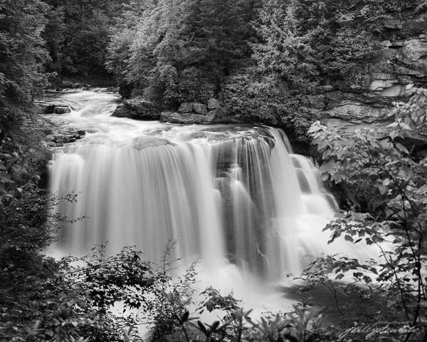
Take a look at the two images below. The first is a straight “monochrome” depiction of Blackwater Falls in West Virginia. It’s a beautiful image, full of light and excitement and depth. These characteristics are imparted solely by the subjects, which are entirely shades of neutral gray (you may see color, but it’s because your monitor is not neutral–most are not). This depiction represents what comes out of the standard B&W developer or when you convert an image to B&W in a digital workflow.

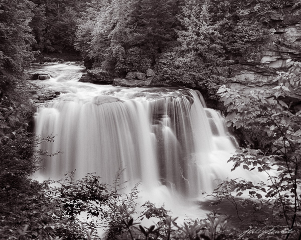
Now look at the second image. It was given a treatment that selectively toned the shadow areas as if the print was toned in my darkroom method for selenium toning. The mid tones and shadow areas now have this deep purple (so called “eggplant”) tone.

Blackwater Falls at Full Force

Blackwater Falls at Full Force
“Blackwater Falls at Full Force” – Limited edition archival pigment print, up to 40×32 inches


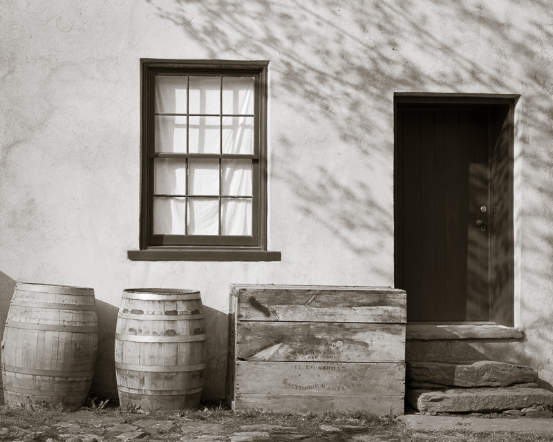
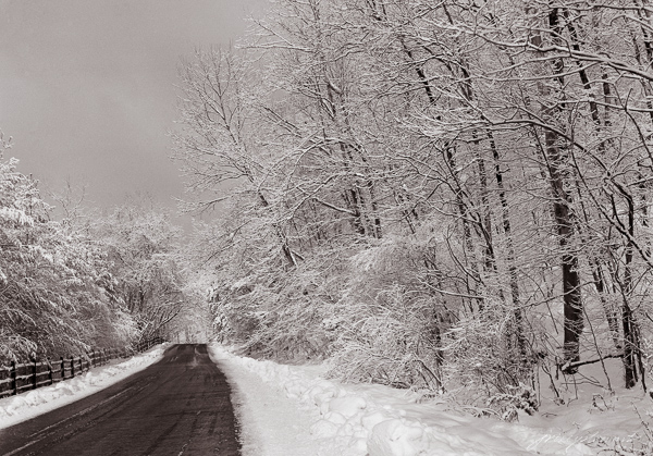
There are many other tones besides the ‘eggplant’ of selenium toner that artists can choose to use. For some images, I like a warmer tone that mimics Kodak Brown Toner I used to use on wet prints made in the darkroom. Brown toner is very effective in giving a more nostalgic aesthetic to some subjects, such as those in my Virginia Grist Project and other old architectural subjects, like “Dappled Shadows” below.

example of a warm-toned print
“Dappled Shadows on a Store Front” – warmer brown tones gives a nostalgic aesthetic to old architectural subjects.

How do you feel about the two different presentations? If the second image appears to have more depth in the shadows, it’s because the cooler purple color appears to recede behind the screen surface; the comparatively warmer whites appear to be in front of the shadows. This therefore tends to push the highlights in the water forward and causes the trees and other shadows to fall back into the image, much like the red and blue squares above, creating a greater sense of depth in the image.  Depth in a two-dimensional picture encourages the viewer to want to engage in the picture, something all visual artists want from our audience.

There is also an emotional aspect to the image I think is important. Hues in the purple range are known to induce a sense of calm and creativity, of wonder and exploration. Purple is a very emotional color to most humans.  The toned image of this enormous waterfall therefore creates an internal conflict that is very subtle, but still there. First, you stand before this potentially dangerous, powerful, noisy waterfall that most of us react to with a bit of anxiety, red flags goes up in your consciousness: beware!  But surrounding the waterfall on all aspects is this calming tone that encourages exploration of the shoreline, the trees, the flowers and rocks along the river’s banks. This is a conceptual contrast, and one I think adds drama and excitement in the toned print that isn’t so apparent in the untoned print.

I always tone my B&W prints, varying between a cooler (more bluish) to a warmer (more reddish) selenium tone, depending on the subject of the photograph. It’s always a very subtle tone, not even as much as I’ve shown you in the second image above, which I exaggerated for purposes of this article.

If you make B&W prints (or even web images), experiment with toning to emphasize the feelings you want to compel in viewers. There is a infinite number of possibilities.  In Lightroom, use the Split Toning feature to do this. For the toned image above, I set the Highlight toning saturation to 0 and the Shadow saturation to 9, hue 354. I set Balance to +50, favoring toning to the shadows.

To my heart, monochrome images should be way more than black and white!

Do you already tone your B&W images? What are your experiences? Let me hear your thoughts.

Cheers!


Update on Dignan’s 2 Bath C41 Development


I’ve been using Kodak’s Flexcolor chemistry for 4 years with acceptable results, but have found the variability from day to day and batch to batch to be irritating. I thought it worthwhile to test a simpler formula published many years ago called the “Dignan’s 2 Bath C41 process.” (see http://www.apug.org/forums/forum223/34413-dignan-ncf-41-divided-color-negative-developer-2.html).

Using Kodak chemistry essentially requires mixing a fresh stock solution that must be used within a week’s period, even if developing far less than the the published capacity claims. In low volume operations, this can mean higher cost per roll/sheet, since you are forced to throw away “unused” developer. The modern C41 chemistry workflow requires very careful measurement of 4 solutions,  and tight temperature and time controls to make it work reliably in small volume manual operations such as small tank or tray development. If you have an autoprocessor like a Jobo, this may not be important to you. But I still develop my 4×5 negatives in open trays sitting in a tempering bath, and tightly controlling temperatures over several hours is challenging.

As a test, I purchased the chemicals required to mix Dignan’s C41 developer, which requires two stock solutions (A and B). The workflow is far simpler with this formula. First the negatives are bathed in Solution A for a time, then transferred to Solution B for a time. Bleaching, fixing, and stabilizing then occurs as with the Kodak workflow. The 2 batch workflow is claimed to be temperature tolerant: somewhere around 25 degree C and it need not be precise. The instructions prescribe at least 3 min in Solution A and at least 6 min in Solution B, with no wash between solutions. Sol A never exhausts because it doesn’t oxidize nor does it dilute over time. You just keep using it until you deplete the volume, and mix up another batch. Sol B is one-shot because the carryover Sol A on the negatives will consume the buffering power of Sol B quickly.

Most of the discussion on the boards about Dignan’s chemistry are quite old, perhaps dealing with older films, and were not very encouraging. My main concerns, based on the discussions, were 1) low saturation negatives and 2) grainy negatives.

I found both concerns eliminated after a simple test. I shot a full-scale color print (Colormunki print test onto canvas) placed in full sun using a 4×5 camera loaded with Ektar 100 film. I developed one sheet in Dignan’s formula for twice the rated times (i.e., 6 minutes in Solution A and 12 minutes in Solution B) at 30 deg C.  The next day, I developed the second sheet closer to the prescribed time and temperature: 25 deg C, 3 min Solution A and 6 min Solution B. Solution B must be fresh, but I used the same solution from the previous day’s work. In both cases (Day 1 and Day 2), the pH of my Solution B was 11.88 at 25 deg C.

Here’s a jpg of the scanned and converted negative from Day 1 (i.e., higher temp and time periods). The colors are fully saturated and the amount of grain was very typical to what I see with Flexicolor chemistry on Ektar (i.e., very fine).  There were minor color shifts I had to correct in software, but again, they were pretty typical of what I see using Flexicolor chemistry on Ektar film.

Dignan2BathTest-9_4Kat6m-editcolorcorrection-hipass3px

Even with the higher temperature and extended times that I used on Day 1, I still noticed some color mottling across the film frame that indicates uneven development. I saw this especially at the edges of the negative, and this was very obvious with the Day 2 negative, for which I used the published time and temperature specifications (75 deg F, 3 min Sol A, 6 min Sol B).  This tells me that I need to further extend either both time or temperature in both Sol A and Sol B. I don’t believe exhaustion of Sol B on Day 2 was the culprit because the pH had not changed. Instead, I  suspect that these modern films are engineered to maximize penetration of chemistry into all emulsion layers at high temperatures and short times, since the normal development of C41 is 100-103 deg F for 3:15 minutes.  I plan to adopt 100 deg F for 5min (Sol A) and 10 min (Sol B) as an arbitrary start point for further testing. I know this defeats one of the benefits of the 2 Bath workflow (i.e., room temperature processing), but it believe it will be necessary.

If you are searching for alternative C41 developers, you might try this old fashioned formula. It’s very simple, cheap, and should be robust.

Update 10/28/15:   I’ve been testing further. My thoughts above haven’t changed, but now I’ve developed a number of real negatives and I’m even more impressed with the NFC-41 workflow.  Scans well, minimal grain (Ektar and Portra films).  Some of the problems I’m seeing with uneven development have to be worked out. I typically use tray development, and I suspect that even though I’m getting good saturation in Bath A, it’s more important to agitate in Bath B to get even development. A couple of my negatives seem “undeveloped” in the centers of the negatives, where they have the most tendency to stagnate the flow of Bath B while in the tray. Tray development may not work here: either a carrier that can be taken from Bath A to Bath B without the need to manually shuffle the negatives, or perhaps using BTZ-like development tubes. I’ve used BTZ tubes before and they work great, but you have to constantly roll the tubes and that’s a pain.

Warning:  There is no real “buffering” power of Bath B. It’s only potassium carbonate and potassium bromide; no buffers. So be sure to use fresh Bath B for every set of negatives. I tried to test the capacity of Bath B by running several negatives before changing to fresh. The pH went from 11.9 (fresh) to 11.2 (used), and the last negatives were extremely thin. The bath volume was about 500 mls, and probably 5 drained negatives went through it. So, don’t trust that Bath B has much more capacity than a couple negatives..test it in your own workflow. One idea for stabilizing Bath B capacity would be to adopt a suitable buffer, e.g. Sodium bicarbonate: Sodium Hydroxide. The range of pH for this pair is 9.8-11, adjustable by the amount of NaOH added. Kodak Flexicolor pH is 10.03, and that should be the target pH of the bicarbonate buffer used in a putative “improved” Bath B.  I might try this. it would be extremely cheap and convenient since the ingredients are available as baking soda (sodium bicarb) and Red Devil ® Lye.

Update 11/5/2015:  After several more negatives, tray developed at 100 deg F for 6 minutes in both Bath A and Bath B, I haven’t stabilized the process. The image on the negatives has consistently been thin using this approach. That can be a good thing if you’re scanning your negatives like I do, but what’s happening with my technique is that I’m getting “too thin” negatives.  I’m giving up on this for the time being…may return for further experimentation later.


Behind the “photographer’s eye”

Falling Light, Grand Tetons “Falling Light, Grand Tetons” Cover feature for the February 2015 edition of Elan Magazine

I sometimes hear “you have a good eye” when speaking to folks visiting in the gallery. They are being complimentary of course, saying that they like the subjects, find them interesting, and clearly are worthy of a  picture. They might even have been emotionally affected by the photograph, an outcome every artist hopes for.

Making an emotional photograph requires so much more than the subject alone. It must also tell a story that moves people. Having a “good eye” isn’t nearly enough.

As humans, our eyes can see almost 180 degrees (a full semicircle) in front of us. There may be hundreds or thousands of distinct objects within that field of view, especially in nature. Including too many of them or putting them in the wrong position in the photograph will make it difficult to tell just what is going on.

Master photographer Ansel Adams once said “There is nothing worse than a sharp image of a fuzzy concept.” That was his way of saying that good photographs tell a clear, compelling story. And just like a literary story, the photograph must have a leading character –a subject– certainly, but it must also place that subject in context with other elements of the story in order to evoke an emotional response.

I think that telling a good story is the hardest part of creating art photographs. Sometimes the lighting isn’t right. Sometimes the colors or tones clash. Sometimes the rhythm is way off. Lighting, color, and rhythm are each important contextual elements that can either celebrate or belittle the best of photographic subjects.

I want to use “Falling Light, Grand Tetons” as an example of one approach to making an artful photograph.

A couple years ago I visited the Grand Teton National Park in Wyoming specifically to take pictures. One of my objectives was to capture a picture of the famous Moulton barn on Antelope Flats, one of the most photographed barns in America. A quick Google search illustrates how others have photographed this subject: Typical Moulton barn photographs

The image just below is an unaltered image of the scene that closely approximates what my eyes saw at the time. This view approximates what anyone would see if standing next to me at the time.

I saw a story in this scene. It was a story of human struggle on the high plains of the Grand Teton mountain range. The main subject was the old abandoned barn, dominated by the eternal, massive, menacing mountain range. To me, it was a story of humanity’s neverending fight with nature: in this case a battle lost by those who abandoned their homestead simply to survive.

But my story wasn’t being told very well in my first take. I felt my subjects were weak and not really as sublime as I wanted them to be. I needed to isolate the barn–my leading character–within the scene and make it appear more intimate with the mountains.  So I changed to a vertical perspective and replaced the lens with a zoom lens.

Falling Light, Grand Tetons

Compositionally, I felt that this was getting closer to my story: the barn was now isolated from the surrounding visual clutter and the supporting subjects (the mountains and foreground) were in the right proportion. Placing the barn near the bottom of the frame supported an illusion of pressure and force of nature upon it.

But things still lacked a strong sense of desolation and hardship that was important to my story. The tension and sublimity I felt on site was missing in the photograph; my camera had failed to capture my emotions (as it always does). In other words, other contextual elements were not supporting my story. I knew I’d need to modify them for my story to be told well.

This image clearly needed help with the lighting, so dodging and burning was called for. Dodging and burning are techniques used to brighten (dodge) or darken (burn) specific elements or areas of an image to create an illusion of light and shadow. These techniques have been used since the invention of photography, and I use them often as I artistically interpret my photographs. Here I felt the barn (and therefore the foreground grasses) needed brightening to make it clear that it was the subject of the story. The mountains also required a bit of contrast boost to make them appear menacing and stark.

The final important changes affected the colors in the image to emphasize rhythm and visual depth. Warming the mountain peaks and the foreground accomplished both. The warmer foreground advances toward you, inviting you into the scene, and the warmer mountain peaks improves the illusion of them hovering (dangerously?) over the barn. I felt the final result told the story I wanted to tell about this famous barn.

Making successful photographs requires much more than having a good “eye.”  Finding a great subject is certainly critical, but telling a story about that subject is so much more important. Not everyone will see the same story as the photographer. But this is true: if the artist tells a good story, it is much easier for someone else to emotionally engage in the scene and dream up their own setting, plot, or ending. And that’s what art is all about.

If you are an art photographer, here’s a trick I’ve found useful.  Force yourself to title the final photograph before you click the shutter. Use a conceptual title, such as “Falling Light”, “Fight with nature”, “desolation and abandonment..” or whatever reflects how you feel about the scene before you. Once done, you have a concept about the story you want to tell. That concept will then guide you as you compose and interpret the scene much better than a title like “Barn in the Grand Tetons”  or “DSC12345678-1.”

Happy storytelling.

Subscribe to our mailing list

* indicates required

Location

Email Format

View previous campaigns.


Creative Photography: Making Snow Look (and feel) Like Snow

Along Lime Kiln Road in Winter

I like photographing snow because snow can create settings that are absolutely beautiful and very photogenic. My favorite rendering of snow scenes is in black and white. I think the absence of cold colors lets the textural and tactile beauty of snow really shine through.

Texture in any fine art photograph is critical to our acceptance of the scene as something worthy of our interest and engagement.  In wintry snow scenes, we need to see the texture before our brain really recognizes snow as snow instead of just white blobs. Once your brain recognizes snow as snow, it then encourages you to enter the scene and become a part of it, and then you can enjoy it!

It’s somewhat of a paradox, but to recognize snow as snow, it can’t be pure white. In fact, my favorite snow scenes have many shades of gray, from very light to very dark. Here’s a general tip: It’s the gray tones in a B&W photograph that make it beautiful; all you need is a very little bit of pure white to give a sense of light to the scene.

As an example of what I’m talking about, I offer “Along Lime Kiln Road in Winter.” I took this picture during 1/30 second just after our snow storm of December 2003. It was a beautifully calm snow fall, allowing the delicate white flakes to cling to the smallest branches of the barren trees. As they say, timing is everything: 15 minutes later the wind came up and caused the flakes to lose their grip and fall to the road, turning the page from the story I’d seen when I clicked the shutter. Does the snow look (and feel) like snow to you? How much pure white do you see?

At this time of year we see lots of snow scenes on Flickr, Facebook, and Pinterest. As they catch your eye and your emotions, ask yourself why that happened. Chances are, it’s because the snow actually looked like snow, full of texture and details that give it identity!

Stay warm!

Jim

Are there limits to artistic freedom in photography?

Most people who take pictures use them just as they come out of the camera. But this is rarely the case with photographic artists.  Artists may spend hours on the best images to transform the image provided by the camera into an image that meets their own artistic vision of the scene: this is the creative phase in photography. In this regard,  the photographic artist differs from artists who use paints or charcoal only in the medium used to fix the subject within a defined frame.

The creative approaches used by photographers during the creative phase–that phase in which the artists exercises the most artistic freedom– vary greatly. While one artist might limit his/her manipulation of the image to adjusting the lighting to create a more dramatic effect, another might take that same scene and compile it with several other images to create a ‘scene’ that departs drastically from what the camera saw; in fact drastically departing from reality. Jerry Uelsman was among those who exaggerated that definition by merging various photographs to create composite images. He became quite famous doing this (see http://www.uelsmann.net/).

Photography has been traditionally a documentary technology used to capture on film an image produced by light waves emanating from a scene in front of a lens.   Because of this documentary aspect of photography, most people today still believe, and  expect, that a photographic image is essentially a factual representation of an actual scene, setting, subject, or incident.  When you ask the the man on the street  whether a picture is “real,” they will tell you that it is unless it obviously isn’t (such as the proverbial rabbit head on the body of a moose or the beautiful but fantastical composites by Uelsmann).

In the digital camera age using photo editing software, it’s a simple matter to overlay 2, 3, or 16 different camera shots into one “photograph.” Whether it’s Uelsman’s merging of several negatives or a modern digital photographer’s merging several digital files, the essence of fact that distinguishes photography as a documentary technology can be completely lost. So my question is.. “When does artistic freedom begin to contradict the fundamental definition of photography?” If compositing multiple images isn’t photography, then what is it?

When it comes to artistic freedom in general, I say “to each his/her own.” But that’s not my opinion when it comes to defining photographs. Photographs should be kept a pure art form. I think that every pixel (or grain of silver) should represent a wave of light that entered the camera and struck the sensor/film at the time of capture of the subject or scene.

Artists who paint or draw can put whatever feature(s) they want on the pallet before them and no one questions it because no one accepts a painting as representing reality: we all know it’s the artist’s imagination that we see on the canvas. I believe those who do the same using photographic images aren’t photographers, but they are artists, still. But what do we call this if not photography? Perhaps it’s more precisely an illustration.

Why should this matter to the fine art community and to photographers specifically? Because if we continue to merge multiple photographs into one image and still call it a photograph, then the art form we know as photography will revert to a tool no different than the paintbrush, spatula, or pencil in the hands of a skilled realist. Photography will have no distinction as an art form itself because it will not longer have a distinctive “form.” In fact, fine art photography may cease to exist. Beautiful vistas of the Grand Canyon will no longer be credible (“was that ridge really in the scene or did the photographer merely put it there?”). We’ll know this has happened when our viewing public expects that an image has been “photoshopped,” whether it has or hasn’t.

Where should photography draw the line regarding artistic freedom in image manipulation?

My opinion is that as long as the image doesn’t contain a physical entity that wasn’t there when the shutter was clicked, it’s a photograph. So putting a boat into a picture of a mountain lake, when that boat wasn’t there at the time the mountain lake was captured is not photography. But enhancing lighting by dodging and burning or setting levels, cropping, or enhancing colors, none of these change the content of the photograph as it was captured, and thus remains a valid documentation of light hitting the film (or sensor) when the shutter was clicked.

I’m certain this opinion will be hotly debated..I’m not the first to raise it as an issue for our times. What do you think… are then ANY bounds is how we define photography today?  When does a photographer stop being a photographer and start being an illustrator? Do we owe it to our art public to keep photography ‘real?”


Using film in a digital world…not such a strange thing.

My mother-in-law, a wonderful person, has always enjoyed taking pictures. Her first camera was a Kodak Box Camera when she was a little girl. She’ll turn 89 this October. I’ve rarely seen her without a camera since I’ve known her these past 39 years.

Today she owns two cameras, one a digital and the other a film 35mm. She’s had the film camera for many years; the digital was a recent gift. So guess which one she uses the most: Her favorite is the film camera. She’s hardly used the digital.

Most of us take the differences between digital and film workflow (meaning the procedures necessary to generate a picture for viewing) for granted. We’ve either grown up with computers or have been using them long enough that the use of computers to capture digital images, print them, mail them, etc is no big deal. But to someone in my mother-in-law’s generation, accepting that the picture you just snapped now resides on a small “chip” in the camera that you then have to somehow get into another device that can print it….well, that can be a big hurdle. Especially when they know how easy it is to snap the picture and take film to the drug store for processing and printing. Her biggest problem today is finding a place that sells film. So I recently hooked her up with my preferred film supplier, B&H Photo in NYC (www.bhphotovideo.com). Now she can just call them when she needs refills on film.

Wait. Did he say “his preferred film supplier??” Yes, I did. You see, I shoot more film than digital, even though I have a perfectly capable digital camera (a Nikon D200) and I know digital workflow inside and out. Nor am I an octogenarian like my mother-in-law. I’m a mere quintagenarian (is that what they call “50 somethings?”).

So why am I using film in this digital age?

I get that question alot from my photography friends, usually it comes with that “what a dinosaur” look to their faces. To be honest, sometimes even I wonder why I’m hanging onto this 20 Century technology, and am tempted many times by the simplicity and ease of using a fully digital workflow. Yet, I haven’t, and likely never will, give in to these temptations. Why not? Here’s my top six reasons:

1. I get higher quality images using film. With film, I get better resolution than my 10mp digital camera when I need bigger prints. Film lets me capture a much longer scale with film- I strive to capture in my images both deep shadow details and sunlit cloud details, a look that I adore in photographs. There are technical reasons why, but digital sensors aren’t as sensitive at both shadow and highlight ends of the light scale to create the same tonal range as film.

2. I never have to worry about electronic failures that cause me to lose my images forever. Erased files, hard drive crashes, card failures–not a worry to me with film. Once I get the film developed I have it forever to rescan.

3. Film is extremely flexible since it’s a Write-Once-Read-Many format. For a single negative, I can scan it into digital form an unlimited number of times. I can scan it to 10mpixels for routine web or small print presentation, then later rescan them to 35mp (35mm negatives) or 75mp (120 medium format and 4×5 large format films) in true 16bit color. Thus, I can create huge prints (40″ x 60″ or more) this way, and those prints are high quality prints comparatively free of pixelation or other “overenlargement” artifacts that we get with 35mm digital cameras. You can buy the larger format digital cameras, but the cost compares to buying a car. No thanks.

4. Shooting film slows me down when shooting and speeds me up when processing my images. When shooting, I take more time composing each shot and shoot far fewer pictures of the same scene. By slowing down when shooting, I realize a greater appreciation for the scene; I’ve taken more time to analyze what’s before me and what inspired me to stop in the first place. I enjoy shooting more because of this. When I shoot digital, I know I have space on my memory cards for over 700 pictures. So like most digital photographers, I just snap away, taking perhaps dozens of pictures of one subject. It can be argued that this is an advantage, and in some ways it is. But–and here’s where film speeds me up– when I get home my job of culling my film shots is quicker than it is with digital. After all, I have far fewer (but better) images to deal with. I throw away alot more of my digital shots. And when I throw them away, I mean I delete them from my camera and computer, never to be seen again (see #2 above).

5. I love working with film. After thousands of times doing it, I still get a thrill seeing the negatives (both B&W and color) when I take them from the wash and hang them to dry. I get another thrill when I scan (i.e., digitize) them. And I always have the thrill when printing, which is my preferred way to present my final images. Yes, developing and scanning film is more work (actually I consider it play), and it takes experience to develop a reliable workflow for developing and scanning, and a bit of cost. But to me the thrills are worth the effort of working with film. I agree such hands-on approach is not for everyone. But, you don’t have to do it this way to use film (keep reading).

Like many professional fine art photographers, I use both film and digital cameras. While I prefer film for most of my professional work, I will use my digital camera when:
– it’s the only camera I have with me (this is ALWAYS the best camera available: the one you have with you!)
– when I don’t trust myself to make the right exposure. I sometimes need immediate feedback after I shoot the frame (we call it ‘chimping’). Sometimes it’s difficult to meter sunrise/sunset conditions or when shooting into the sun, so rather than miss the shot I will shoot it with digital, making adjustments and multiple shots until I get it just right. One day I hope to learn a better way.
– related to the point just above, I use my digital camera like photographers-of-old used polaroids, to evaluate a shot before investing the time to set up the big cameras.
– when I am shooting subjects for which I don’t expect to need large, high quality prints. These include corporate work, family shots, social events, and such.
– when I want (or need) a quick product– this doesn’t happen very often and it’s usually a matter of preference rather than need. Sometimes I just want to post a pretty picture on my Facebook page to say “look what I saw today!”

A digital camera is a great invention for many of our picture-taking situations. But it’s a mere rumor that “film is dead.” In many ways, film is superior. In a few ways, digital is superior. If quality and flexibility is important to you, film is the way to go.

I use 35mm, 6×7 medium format, and 4×5 large format film cameras in my work. You can still take rolls of 35mm to your local Costco or CVS Store and pay about $1 per roll for them to develop. They will scan it  at 2400 ppi for about $3 per roll of 36.

So try this. Chances are good that you have a 35mm film camera sitting in a drawer somewhere. Dig it out and shoot a few rolls of film. When you get the prints back (or have your developer scan them to CD for you), compare the pictures with your more recent digital camera shots. I think you’ll be amazed at how much better film captures the essence of your experience. We’re so accustomed to seeing blocked out whites in our digital pictures today that I think we’ve lost appreciation for those delicate soft wispy whites and very fine tonal changes that our eyes actually see. Film is much more capable of capturing those attributes.

Let me know if you’re happy with the result. If you are, keep the film camera handy, chances are you’ll be using it more and more.

Happy shooting.

Jim