A Short Trip to Amish Country

Distinctive crop patterns in Amish Country, Pennsylvania
“Clear Boundary” – Crops share a mighty thin line on this farm in Amish Country, Pennsylvania.

From northern Virginia, we needn’t go far to see a very different culture than we have in most of the United States. I found udder peace (whoops, my bad)  in Amish Country.

I recently spent 3 days in the Pennsylvania Amish Country. It was a strange experience. I was deep in rural agricultural land, but it almost felt like urban. Finding pull offs along roads, finding compositions to photograph, and the ever-present sense of “unwanted attention” were constants.

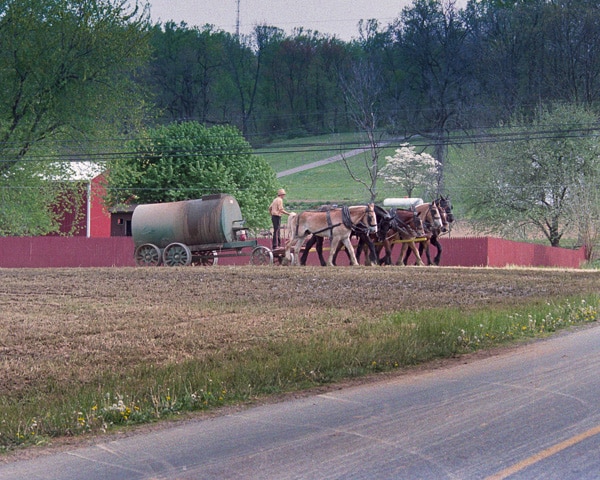
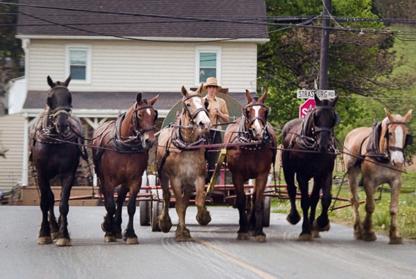
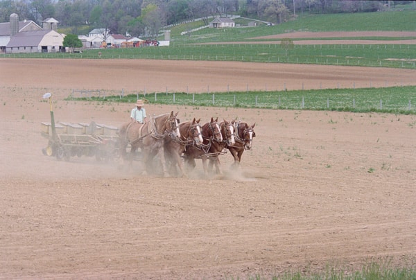
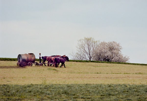
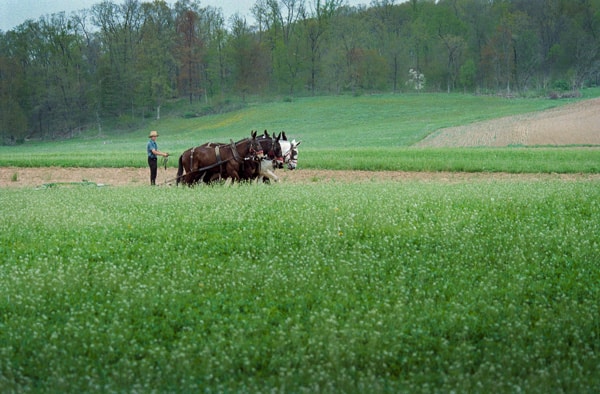
My trip to Lancaster County, Pennsylvania was just what I needed. Visiting the “Pennsylvania Dutch” is like stepping back into the early 20th Century, driving the backroads at speeds no faster than horse-drawn carriages, stopping for long periods of time just to watch the Amish work their fields with mules (who actually did most of the work, I admit), and taking in the unique smell of natural fertilizer spewing from the their “honey” wagons.

Lancaster County is only a couple hours from my home, and I’ve been thinking all winter that I needed to go up there and experience it again after many years. Having grown up on a farm myself, pastoral settings have always been a favorite of mine. We have a saying in Oklahoma “you can take the boy off the farm, but you can’t take the farm out of the boy.” That’s so true, I think.

In fact, I avoid cities when I can. Even in Lancaster County, I accidentally drove too close to the town of Lancaster on my first day, got caught up in city traffic and strip malls for an hour, and considered for a moment just heading home. “If this is what Amish Country has become, I’m done!”

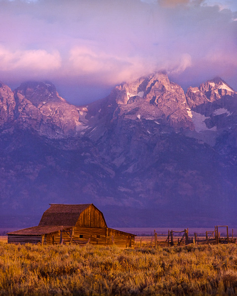
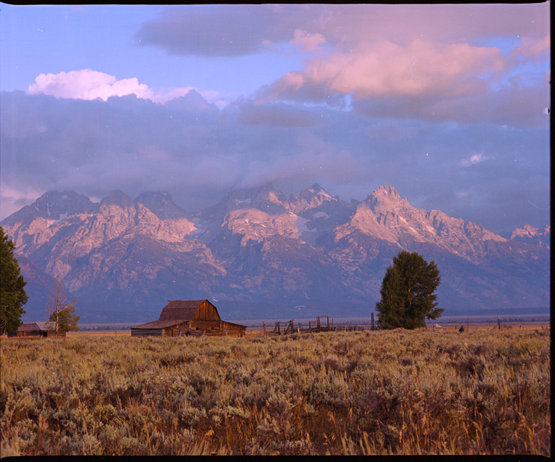
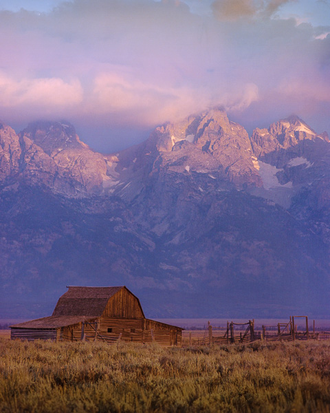
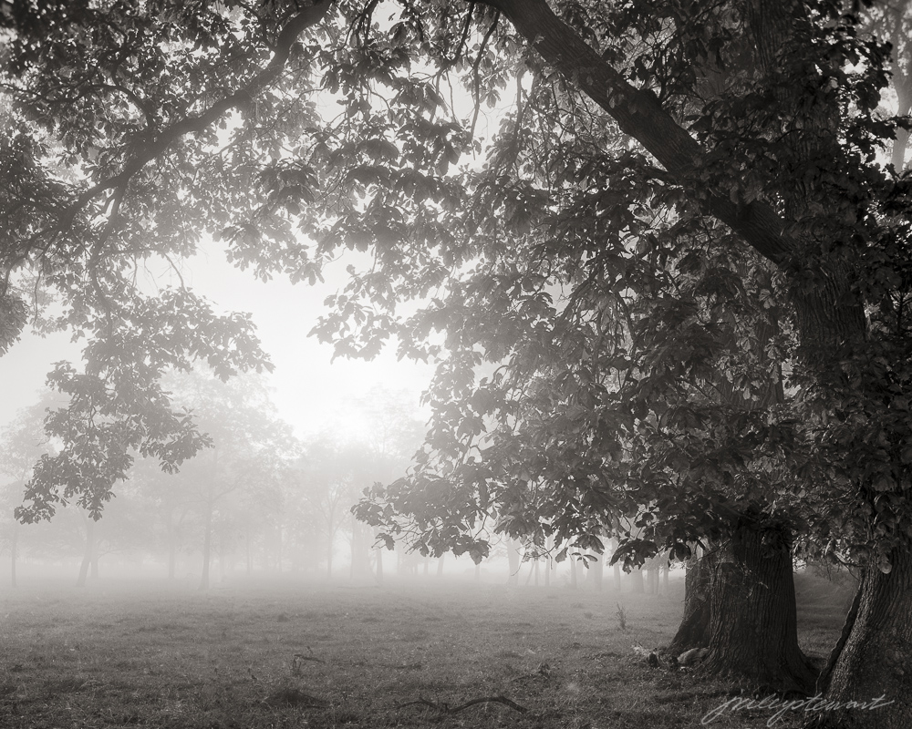
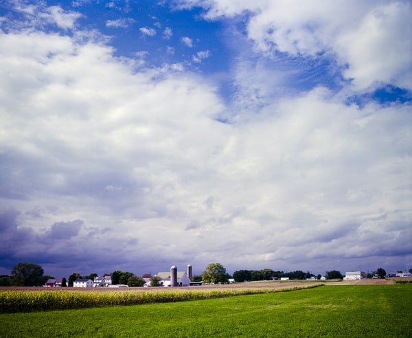
Luckily, I quickly escaped modern humanity and spent the next 3 days traveling every back road I could find to the north, east, and south from Lancaster. This is where the rich Amish culture lives today, and I was surprised how strong it remains after all these years of American ‘progress.’ The Amish in their horse drawn carriages, farm teams, and foot-powered scooters were common sightings among the beautiful farm lands and buildings of rural Lancaster County. I’ve included a few travel photos below to give you an idea of what I found.

Photographically speaking, I met with several challenges to how I normally work in the field, to the point of giving that up for something else. I normally just pull off and park on the road easement when I find something to photograph, and then take my time setting up and composing the scene. I can be on site like this for half an hour or more.

But road easements in Lancaster County are essentially non-existent except where the rare power line happens to follow the road. Without utility easements, the Amish plant their crops to within a few feet of the road bed, making pulling off the road to photograph impossible. I would never drive onto their crops just to get a picture.

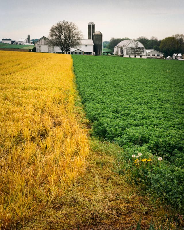
I was able to find and capture “Clear Boundary” (my opening picture) along a road where the easement was wide enough for my van to park safely while I composed the shot. And I didn’t have a lot of time to do that because I had to share the easement with farm machinery pulling over to allow car traffic to pass. Oh, the life of a landscape photographer! :)

The second challenge was that most of what I found that really interested me were scenes that included moving subjects. Things that move have to be photographed quickly, and in many cases repeatedly. That’s not so easy with the large bellows camera that I typically enjoy using.

So after the first full day of empty searching for “normal” situations, I decided to pull out my faster 35mm film camera with a zoom lens attached and just have fun shooting from the van window with butt in seat. These will never become large exhibition prints, but not everything we photograph has to be “serious,” I guess. I thought you might enjoy seeing what I saw.

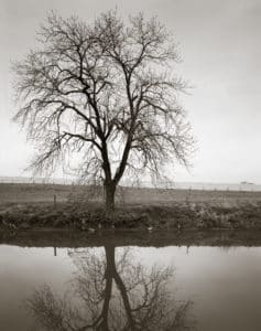
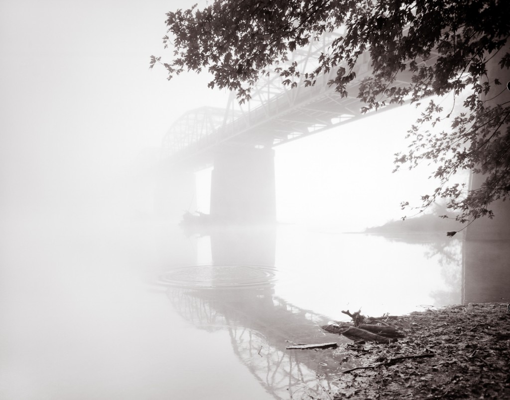
I’ve added two images from the trip to my gallery, and they are now available. The first is “Clear Boundary.” Just click the picture to see it in the gallery. The other scene is “Bifurcations,” a quiet B&W composition of a lone tree reflecting itself in the Pequea River in southern Lancaster County. See it here: “Bifurcations

Image of the delicate bifurcations of a bare tree reflected in a river
“Bifurcations” – The elegance of a lone tree is only made greater when reflected.

More images from Amish Country.


What’s in a Name?

Heavy morning fog on the Potomac River adds mystery to this otherwise peaceful water scene.
“Bridge to NoWhere” –Heavy morning fog on the Potomac River adds mystery to this otherwise peaceful water scene.

I want to share something that you may take for granted, or perhaps never even thought about, and that is “..where do art titles come from?”

As art lovers, we’re accustomed to seeing titles on artworks. Titles are a convenient way to refer to a particular painting or photograph. So instead of saying “that photograph by Gurski of the Rhine River that someone bought for $4,200,000” we simply know it as “Rhine II.”

Photography lends itself very well to titling of images using nominal or geographic descriptors. That’s the tradition of photography. Whether it’s Weston’s “Pepper” series or any number of Ansel Adams’ titles (“Half Dome,” “Snake River”), or even Gurski’s “Rhine II.”  The title of the image often reveals the name of the subject itself, no question about it, just call it what it is.

I find such an objective approach to titling photographs a bit lacking. When I stand before a scene in the field,  I try to think about the concept I want to communicate, the story the scene is telling me. It is this story that I want the title to describe and not so much the physical entity in the picture. The title I give to a finished photograph often reflects the story that struck me at the time of capture. In fact, I often write the “working title” on the field log I keep for every picture I take.

For me, it’s important to title my photographs this way. It helps me recall how I felt when I discovered the scene, and it helps me know how I want to interpret the picture to extend and clarify that feeling.

“Bridge to NoWhere” is a good example.  This historic bridge over the Potomac River completely disappeared into the heavy fog on this particular morning. The far end of the bridge and the far river bank had completely lost all identity, at least in this story. In reality, I knew where the bridge went, but a title such as “Point of Rocks Bridge over the Potomac River” wouldn’t have communicated the mysterious nature of events that I saw when under the darkcloth.

Every artist has their own way of titling their artworks, and none of them are wrong. I have to admit, though, that when I see a piece of art titled “Untitled,” …well, I just don’t get that. Regardless, whatever the artist has named a particular scene, don’t let it keep you from dreaming up your own story. It’s your fantasy, so write it however you want!

Update on Dignan’s 2 Bath C41 Development


I’ve been using Kodak’s Flexcolor chemistry for 4 years with acceptable results, but have found the variability from day to day and batch to batch to be irritating. I thought it worthwhile to test a simpler formula published many years ago called the “Dignan’s 2 Bath C41 process.” (see http://www.apug.org/forums/forum223/34413-dignan-ncf-41-divided-color-negative-developer-2.html).

Using Kodak chemistry essentially requires mixing a fresh stock solution that must be used within a week’s period, even if developing far less than the the published capacity claims. In low volume operations, this can mean higher cost per roll/sheet, since you are forced to throw away “unused” developer. The modern C41 chemistry workflow requires very careful measurement of 4 solutions,  and tight temperature and time controls to make it work reliably in small volume manual operations such as small tank or tray development. If you have an autoprocessor like a Jobo, this may not be important to you. But I still develop my 4×5 negatives in open trays sitting in a tempering bath, and tightly controlling temperatures over several hours is challenging.

As a test, I purchased the chemicals required to mix Dignan’s C41 developer, which requires two stock solutions (A and B). The workflow is far simpler with this formula. First the negatives are bathed in Solution A for a time, then transferred to Solution B for a time. Bleaching, fixing, and stabilizing then occurs as with the Kodak workflow. The 2 batch workflow is claimed to be temperature tolerant: somewhere around 25 degree C and it need not be precise. The instructions prescribe at least 3 min in Solution A and at least 6 min in Solution B, with no wash between solutions. Sol A never exhausts because it doesn’t oxidize nor does it dilute over time. You just keep using it until you deplete the volume, and mix up another batch. Sol B is one-shot because the carryover Sol A on the negatives will consume the buffering power of Sol B quickly.

Most of the discussion on the boards about Dignan’s chemistry are quite old, perhaps dealing with older films, and were not very encouraging. My main concerns, based on the discussions, were 1) low saturation negatives and 2) grainy negatives.

I found both concerns eliminated after a simple test. I shot a full-scale color print (Colormunki print test onto canvas) placed in full sun using a 4×5 camera loaded with Ektar 100 film. I developed one sheet in Dignan’s formula for twice the rated times (i.e., 6 minutes in Solution A and 12 minutes in Solution B) at 30 deg C.  The next day, I developed the second sheet closer to the prescribed time and temperature: 25 deg C, 3 min Solution A and 6 min Solution B. Solution B must be fresh, but I used the same solution from the previous day’s work. In both cases (Day 1 and Day 2), the pH of my Solution B was 11.88 at 25 deg C.

Here’s a jpg of the scanned and converted negative from Day 1 (i.e., higher temp and time periods). The colors are fully saturated and the amount of grain was very typical to what I see with Flexicolor chemistry on Ektar (i.e., very fine).  There were minor color shifts I had to correct in software, but again, they were pretty typical of what I see using Flexicolor chemistry on Ektar film.

Dignan2BathTest-9_4Kat6m-editcolorcorrection-hipass3px

Even with the higher temperature and extended times that I used on Day 1, I still noticed some color mottling across the film frame that indicates uneven development. I saw this especially at the edges of the negative, and this was very obvious with the Day 2 negative, for which I used the published time and temperature specifications (75 deg F, 3 min Sol A, 6 min Sol B).  This tells me that I need to further extend either both time or temperature in both Sol A and Sol B. I don’t believe exhaustion of Sol B on Day 2 was the culprit because the pH had not changed. Instead, I  suspect that these modern films are engineered to maximize penetration of chemistry into all emulsion layers at high temperatures and short times, since the normal development of C41 is 100-103 deg F for 3:15 minutes.  I plan to adopt 100 deg F for 5min (Sol A) and 10 min (Sol B) as an arbitrary start point for further testing. I know this defeats one of the benefits of the 2 Bath workflow (i.e., room temperature processing), but it believe it will be necessary.

If you are searching for alternative C41 developers, you might try this old fashioned formula. It’s very simple, cheap, and should be robust.

Update 10/28/15:   I’ve been testing further. My thoughts above haven’t changed, but now I’ve developed a number of real negatives and I’m even more impressed with the NFC-41 workflow.  Scans well, minimal grain (Ektar and Portra films).  Some of the problems I’m seeing with uneven development have to be worked out. I typically use tray development, and I suspect that even though I’m getting good saturation in Bath A, it’s more important to agitate in Bath B to get even development. A couple of my negatives seem “undeveloped” in the centers of the negatives, where they have the most tendency to stagnate the flow of Bath B while in the tray. Tray development may not work here: either a carrier that can be taken from Bath A to Bath B without the need to manually shuffle the negatives, or perhaps using BTZ-like development tubes. I’ve used BTZ tubes before and they work great, but you have to constantly roll the tubes and that’s a pain.

Warning:  There is no real “buffering” power of Bath B. It’s only potassium carbonate and potassium bromide; no buffers. So be sure to use fresh Bath B for every set of negatives. I tried to test the capacity of Bath B by running several negatives before changing to fresh. The pH went from 11.9 (fresh) to 11.2 (used), and the last negatives were extremely thin. The bath volume was about 500 mls, and probably 5 drained negatives went through it. So, don’t trust that Bath B has much more capacity than a couple negatives..test it in your own workflow. One idea for stabilizing Bath B capacity would be to adopt a suitable buffer, e.g. Sodium bicarbonate: Sodium Hydroxide. The range of pH for this pair is 9.8-11, adjustable by the amount of NaOH added. Kodak Flexicolor pH is 10.03, and that should be the target pH of the bicarbonate buffer used in a putative “improved” Bath B.  I might try this. it would be extremely cheap and convenient since the ingredients are available as baking soda (sodium bicarb) and Red Devil ® Lye.

Update 11/5/2015:  After several more negatives, tray developed at 100 deg F for 6 minutes in both Bath A and Bath B, I haven’t stabilized the process. The image on the negatives has consistently been thin using this approach. That can be a good thing if you’re scanning your negatives like I do, but what’s happening with my technique is that I’m getting “too thin” negatives.  I’m giving up on this for the time being…may return for further experimentation later.


In image-making, you need to know the story before you can tell it.

Every picture tells a story. Sometimes it’s a story well-told, and sometimes not.

Just as a writer carefully maps out the setting, the plot, and cast of characters long before he/she begins typing a novel, visual story-tellers–those who make images instead of books–also will previsualize the story they want an image to tell.  Previsualization begins when we find or stage a subject that we believe has inherent artistic potential–i.e., has a story to tell–and leads to a point in time when we actually act on that belief by taking its picture or beginning to sketch on canvas.

In photography, previsualization is no less important than it is to any method of image-making. Often our eye will catch something we think has promise, but then we must exercise thoughtful previsualization to make the most of the story in front of us. In fact, previsualization must start with the story we want to tell, and all other compositional decisions we make should support that story.

One of the most important compositional decisions a photographer makes during previsualization is whether the final image will be in color or in B&W.

One good reason to decide on B&W film capture is the creative flexibility that B&W film lends to the photographer. If I can exploit this flexibility, I want to do that. Use of color subtraction filters and the ability to adjust film development to increase or decrease the contrast of the captured image are both good reasons to select B&W film over color film. Color film offers far fewer, if any, creative controls.

But first and foremost, the choice to use either color or B&W film should be based on the scene in front of the camera and what the photographer wants to say about that scene. In other words, does the presence of color support, or does it detract, from the story you want this scene to communicate? This is a question that is just as applicable to digital capture as it is to film capture, and it should be asked during previsualization.

It is so easy to defer the question of “color or B&W?” when shooting in color only, such as when shooting with a digital camera. Since the digital camera always captures the full color spectrum, the tendency is to just capture the scene and worry about converting to B&W later and see which, color or B&W, “looks best.”

This could be a mistake, regardless of whether you’re capturing to a digital sensor or onto film. The reason it’s a mistake is because you’ve also deferred the critical question: “Does my concept for this scene–i.e., the story I want to tell– require color? Does the color in the scene support or does it detract from that story?”  When shooting film specifically, deferring this question until later also means that by choosing to use color film, you have removed any opportunity to exploit the creative advantages that B&W film offers.

I follow the advice of the greats who came before me and try to nail down the story for every photograph I take long before I load the film into my camera and click the shutter. Nailing down the story is the first, and perhaps the most important, part of previsualization. The story not only affects the choice of color vs B&W, but also where to point the camera, choice of lens, and every other aspect of composition. I repeat, being in color or being in B&W is one of the strongest compositional decisions to make: it should be made during previsualization. You should know before you take the picture whether it should be B&W or color.

Deciding on color or B&W is an intuitive decision, and I admit that sometimes, I don’t trust my intuition and will capture the same scene onto both color film and B&W film. Most of the time, I learn that I should trust my intuition more.

Here’s a case in point:

Being Obvious (color)
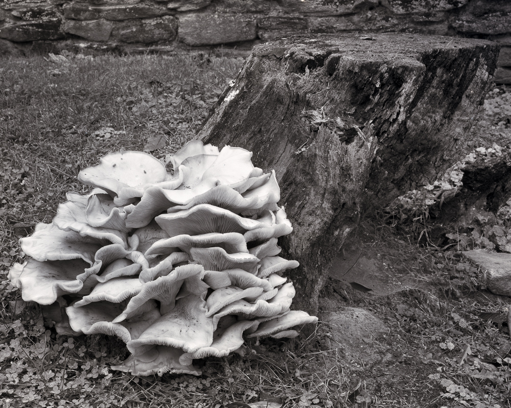
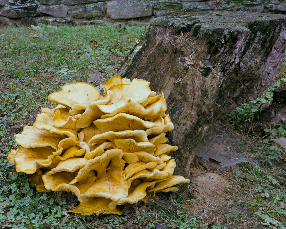
I came upon this massive mushroom this week while out walking on a local farm. It was more than 2 feet in diameter and rested in a bed of clover just at the base of an old dead tree stump.

What was immediately obvious was just how obvious this old mushroom was. It’s size and texture of course made it stand out from everything around it, but it’s color was intense as well. The yellow and orange hues really made it ‘different’ from the cooler greens of the surrounding grass and ivy, and from the old monochromatic stump.  The impression I had, and this became my concept for this scene, was “Being Obvious.”

From that point on, my single goal in taking its portrait was to support the concept of ‘being obvious.’ My intuition told me that it should be a B&W portrait, and by using a pale yellow filter I could enhance separation of the main subject from its surrounding cooler tones quite well. But its mushroom’s color was so intense that I began an inner argument with myself (i.e., with my intuition) that then caused me to take the portrait in both color and in B&W. Both portraits were taken in similar, flat overcast light.

The color portrait is interesting because of the subject, but I think it lacks balance, and the colors present in the scene seem to detract from the story of the mushroom “being obvious. The intense yellow/orange of the mushroom tends to share the space almost equally with the other two major colors: the blue green ivy and the brown stump.  In other words, the natural colors didn’t support my concept very well, even though intense.

I was glad I followed my first inclination and also took the mushroom’s portrait using B&W film. I chose to use a light yellow filter to deepen the tones of the cool green clover and lighten the tones of the fungus, thus exploiting the creative controls possible with B&W film.

Being Obvious
“Being Obvious” copyright 2015, J. Riley Stewart

The B&W portrait better segregates the mushroom from all other elements in the image; the ivy and stump are no longer competing for attention with the mushroom, and this change better supports my ‘being obvious’ story.  The B&W image also is better balanced than the color portrait, as I was easily able to lighten the tones on the far right of the frame to create that balance.  Brightening the same green ivy in the color photograph would not have accomplished the same result.

Had I not previsualized this scene and just took the pretty picture of the mushroom without thinking, I might not have  even thought to “see” this in monochromatic B&W, and would have failed to tell the best story for this fantastic, and worthy, subject.

Which do you prefer? Does this picture say something different to you? Would you have captured this portrait in color or B&W?

Leave a comment below! 

Where are the photography gurus today?

gu·ru  /goo’ roo/  noun: 1) a teacher and especially intellectual guide in matters of fundamental concern; 2)  one who is an acknowledged leader or chief proponent; 3) a person with knowledge or expertise

Along Lime Kiln Road in Winter, copyright J. Riley Stewart, 40x32 in archival pigment print.
Along Lime Kiln Road in Winter, copyright J. Riley Stewart, 40×32 in archival pigment print.

I crave learning from others about the art in photography. Unfortunately, those I grew up learning from about what it takes to make a truly fine art print are no longer with us. I truly miss them. And I bet I’m not alone.

When I started seriously making and printing photographs in the 1970s, my favorite subscription was to Fred Picker’s monthly newsletter. I received it for 3 years or so, then had to abandon it for a couple years, during which he became ill and stopped publishing. But while it lasted, I poured over those pages time and time again to glean every bit of information he shared about making “the fine print.”

I also bought every one of Ansel Adams’s photography learning books, and read them all even though I found them a bit technical and stuffy. Picker’s writing, on the other hand, was fun to read and easier to understand. And he covered more about the art in photography than did Adams.

More recently, I found the wonderful content published online through “The Mindful Eye” by Craig Tanner. You can still access the great lessons he created over several years, but discontinued in 2011: http://www.tmelive.com/index.php/login.html

I consider Adams, Picker, and Tanner to be true gurus of the art in photography. I am unaware of any that today come close to teaching us about the making of artful photographs in any consistent manner.  Sure, there are tons of folks who write short articles about gear (God do we need any more of this???), and others who offer field workshops that focus on shooting tasks, and even some who sporadically write about how they realize their photographic vision, but where are the true gurus today?

Who are the experienced photographers who write specifically and selflessly solely to teach us what we need to know to be better artists?

It’s true that in this internet age, access to information is so much better than it used to be. You’d think that my question would be superflous as we sit in 2015. So, perhaps a better question would ask: “Have these gurus been replaced by Google search, from which we can get hundreds of relevant hits linking us to dozens of articles relevant to the art in photography?”   Uhhh, I don’t think so. I have to admit that when I want to know more about a technique, I can find very useful hits by doing a Google search. But try to find a hit to a credible person writing today about HOW and WHY they approach the making of fine prints to realize their artistic vision. Good luck.

As scant as it is, so much of what is written today about photographic art relates to web viewing and the ‘6 second’ mentality associated with such images. There is very little written about the making of beautiful, large exhibition prints. For example, large clipped areas in an image may be acceptable in 800×640 pixel format, but just try to get away with that in a 16×20 inch or larger print…..ghastly. And how many B&W images have you seen where convergence of gray tones has reduced the artistic impact to zero?  But where are developing photographers (or even experienced photographers) to turn to learn these fundamental lessons, short of trial and error?

If you know of such a source, please share it in the comments below. I’d really like to find them! Who are your gurus?

Happy Learning!SignatureLogo 200x75


PS> Want to see examples of my work? Go to Galleries and more…  Have fun!


I’m not that interested in stepping into the 21st Century

Magnolia Plantation along the Ashley River, SC
“Lowcountry Cypress” (Copyright 2015, J. Riley Stewart), 40×32″ Limited Edition photographic print.

See more at J. Riley Stewart’s galleries

If you still shoot film, what would you do if, for some reason, its supply suddenly dried up? What if film was no longer available at any price?

I know it’s a small possibility, at least in the mid-term, but…. what if?

To most photographers–amateur or professional–this is a moot point. They’ve already turned to digital capture, and most likely don’t care about the availability of film. It’s that very phenomenon that has drastically reduced the supply of film over the past 20 years. Sure, we can still buy film in almost all formats, but the number of brands and types of film is nothing like it was in the past, and those films still available costs us a lot more. But I should add, the modern films available today are exquisite and well-worth the cost.

I still shoot film, mostly large format 4×5 and 120 in both B&W and color. The biggest reason I use film is that it gives me “a look” that isn’t yet possible with digital capture, especially when my goal is to make larger scale photographic prints, i.e., anything larger than 16×20 inches. Film capture enables large prints that are alive with delicate details and textures and tones; prints that make you want to step into them and explore.

So what’s a guy to do if a precious resource behind his passion dries up? I plan to be making pictures for the next 20-30 years, and there’s no guarantee that film will be accessible during that span of time given the direction analog photography is going. Will I have to step into the 21st Century “digital” age?

I think I’ll do just the opposite. Before the digital revolution, and even before Kodak’s release of the first “Brownie” camera in 1900, people were making exquisite photographic prints from wet plates, dry plates, tin-types, and paper negatives printed on albumen-, silver gelatin-, and platinum-coated papers. The earliest photographic processes didn’t require manufactured film to produce beautiful photographs.

All these old processes excite me much more than bits and bytes. Sure, some of my excitement relates to the craft involved with these processes (the “magic” once associated with photography), but most of it relates to the aesthetics of the resulting prints, which we can still see in many of our finest art museums 150 years after they were made.

In fact, I may not wait for the disappearance of film, even if it never comes. If Mathew Brady could do it, so can I.


Subscribe to our mailing list

* indicates required

Location

Email Format

View previous campaigns.


Why I never talk about my “photo gear”

A nostalgic scene from the Shenandoah Valley in Virginia
“One Morning at Liberty Furnace”–A nostalgic scene from the Shenandoah Valley in Virginia

As an art photographer, I’m continually amazed that so many of my peers think that everyone else must be as enamored with photographic equipment as they themselves must be. Why else would they make it certain that I know what f stop, shutter speed, ISO, camera model, and lens they used to take a particular picture?

Maybe they think my knowing this information will be critically helpful when I show up at the same vantage point, and same time of day, and even the same day of the year and under the same lighting conditions, just so I can replicate that very same picture. I can’t think of another reason why someone else would want me to know this information.

Or maybe their web gallery software assumes they want to communicate all the EXIF  data, and there’s no way to turn it off. EXIF data are all those pieces of crap technical information the camera (largely digital cameras) embeds into the picture file where it remains forever. Photo sharing sites like Flickr, Pbase, and others don’t make it easy to make EXIF data invisible to viewers. But it can be done, and they probably should make it easier.

Or, maybe they have nothing else to say about the picture, but they think they have to say SOMETHING….

I’ve written before about the importance of storytelling in art and especially in photographic art. Whether we, as artists, write a narrative that helps viewers see the same story as us or if we choose not to tell our story, the story is still there. Sometimes, the title we give an image is the story. Sometimes the story is meant to be ambiguous, so the less said the better.

The problem I have with overt disclosure of EXIF data is that I find it very distracting. It may be because when I look at an art photograph, my mind wants to  swim among the neurons on my creative, subjective right brain. Then BANG, I notice that the picture was taken with a Canon Mark XXXI with 10-500mm lens at f64 and 1/10,000 sec, and the mood is destroyed. EXIF data excites the objective left brain which competes for attention with it’s right side. Too often the left brain wins.

If you are among those who think that disclosing all that sexy EXIF data is important to anyone besides your camera, you should reconsider that thinking. It can turn people from enjoying the image on its artistic merits to, in some cases, objective revulsion.

So if all you have to say about an image you created is contained in the EXIF data, perhaps it’s time you began saying nothing at all.


Behind the “photographer’s eye”

Falling Light, Grand Tetons “Falling Light, Grand Tetons” Cover feature for the February 2015 edition of Elan Magazine

I sometimes hear “you have a good eye” when speaking to folks visiting in the gallery. They are being complimentary of course, saying that they like the subjects, find them interesting, and clearly are worthy of a  picture. They might even have been emotionally affected by the photograph, an outcome every artist hopes for.

Making an emotional photograph requires so much more than the subject alone. It must also tell a story that moves people. Having a “good eye” isn’t nearly enough.

As humans, our eyes can see almost 180 degrees (a full semicircle) in front of us. There may be hundreds or thousands of distinct objects within that field of view, especially in nature. Including too many of them or putting them in the wrong position in the photograph will make it difficult to tell just what is going on.

Master photographer Ansel Adams once said “There is nothing worse than a sharp image of a fuzzy concept.” That was his way of saying that good photographs tell a clear, compelling story. And just like a literary story, the photograph must have a leading character –a subject– certainly, but it must also place that subject in context with other elements of the story in order to evoke an emotional response.

I think that telling a good story is the hardest part of creating art photographs. Sometimes the lighting isn’t right. Sometimes the colors or tones clash. Sometimes the rhythm is way off. Lighting, color, and rhythm are each important contextual elements that can either celebrate or belittle the best of photographic subjects.

I want to use “Falling Light, Grand Tetons” as an example of one approach to making an artful photograph.

A couple years ago I visited the Grand Teton National Park in Wyoming specifically to take pictures. One of my objectives was to capture a picture of the famous Moulton barn on Antelope Flats, one of the most photographed barns in America. A quick Google search illustrates how others have photographed this subject: Typical Moulton barn photographs

The image just below is an unaltered image of the scene that closely approximates what my eyes saw at the time. This view approximates what anyone would see if standing next to me at the time.

I saw a story in this scene. It was a story of human struggle on the high plains of the Grand Teton mountain range. The main subject was the old abandoned barn, dominated by the eternal, massive, menacing mountain range. To me, it was a story of humanity’s neverending fight with nature: in this case a battle lost by those who abandoned their homestead simply to survive.

But my story wasn’t being told very well in my first take. I felt my subjects were weak and not really as sublime as I wanted them to be. I needed to isolate the barn–my leading character–within the scene and make it appear more intimate with the mountains.  So I changed to a vertical perspective and replaced the lens with a zoom lens.

Falling Light, Grand Tetons

Compositionally, I felt that this was getting closer to my story: the barn was now isolated from the surrounding visual clutter and the supporting subjects (the mountains and foreground) were in the right proportion. Placing the barn near the bottom of the frame supported an illusion of pressure and force of nature upon it.

But things still lacked a strong sense of desolation and hardship that was important to my story. The tension and sublimity I felt on site was missing in the photograph; my camera had failed to capture my emotions (as it always does). In other words, other contextual elements were not supporting my story. I knew I’d need to modify them for my story to be told well.

This image clearly needed help with the lighting, so dodging and burning was called for. Dodging and burning are techniques used to brighten (dodge) or darken (burn) specific elements or areas of an image to create an illusion of light and shadow. These techniques have been used since the invention of photography, and I use them often as I artistically interpret my photographs. Here I felt the barn (and therefore the foreground grasses) needed brightening to make it clear that it was the subject of the story. The mountains also required a bit of contrast boost to make them appear menacing and stark.

The final important changes affected the colors in the image to emphasize rhythm and visual depth. Warming the mountain peaks and the foreground accomplished both. The warmer foreground advances toward you, inviting you into the scene, and the warmer mountain peaks improves the illusion of them hovering (dangerously?) over the barn. I felt the final result told the story I wanted to tell about this famous barn.

Making successful photographs requires much more than having a good “eye.”  Finding a great subject is certainly critical, but telling a story about that subject is so much more important. Not everyone will see the same story as the photographer. But this is true: if the artist tells a good story, it is much easier for someone else to emotionally engage in the scene and dream up their own setting, plot, or ending. And that’s what art is all about.

If you are an art photographer, here’s a trick I’ve found useful.  Force yourself to title the final photograph before you click the shutter. Use a conceptual title, such as “Falling Light”, “Fight with nature”, “desolation and abandonment..” or whatever reflects how you feel about the scene before you. Once done, you have a concept about the story you want to tell. That concept will then guide you as you compose and interpret the scene much better than a title like “Barn in the Grand Tetons”  or “DSC12345678-1.”

Happy storytelling.

Subscribe to our mailing list

* indicates required

Location

Email Format

View previous campaigns.


Who likes art, anyway?

Sunrise Over the Nez Perce, Yellowstone NP  (Copyright J Riley Stewart)

I admit I’m as a newborn when it comes to knowing about art and artists. I’m not professionally trained in the arts. I can’t draw a straight line. And for most of my adult life, I lived in the left-brained, analytical world of science. But I now see that art has always been a large part of my life. I just didn’t know it. Perhaps it’s the same with you.

If someone were to ask me 35 years ago if I liked art, I would have said “no.” Loving art wasn’t a macho thing in the 80s. I didn’t really know what art was unless someone told me something was “art.”  I hadn’t the exposure to art required to have an opinion about it one way or the other.

It turns out I was in the majority.  It’s commonly thought that only 25% of Americans claim to like “art.” And about half of those actually buy or collect significant art pieces.  I wonder if that’s really true, that only 1 in 4 of us “like” art.

Thirty-five years ago I was art stupid. When I later saw Michaelangelo’s “David” in real life I was awestruck. But this didn’t make me an art lover. When I saw the “Mona Lisa;” again, awestruck. But that didn’t make me an art lover either. When I saw an original Ansel Adams’s “Moon Over Half Dome?”…. Again, awestruck; again, not a convert.

I know now that I remained art stupid through all these experiences (and many more), but something was changing in my mind and heart. I began respecting the emotions that art could evoke in me, if I just gave it a chance. Each of these experiences added just a bit of knowledge to my personal art appreciation toolkit, but not enough to know what to do with these bits. I just knew that I enjoyed the individual experiences beyond words.

Creation and love of art is a uniquely human attribute. Something in our DNA compels us to consciously create and love art.  This is not speculation or hyperbole: study after study has shown the value of art in our human lives. Some even believe that art isn’t merely a luxury as others claim; that art is, in fact, necessary to healthy, happy human lives. Why else would our earliest ancestors spend valuable time drawing on the walls instead of gathering food if they weren’t compelled to? Why do hospital patients heal faster when they have art as part of their treatment?

If art is such a universally valuable thing in our lives, why do so many discredit that value? Perhaps one explanation involves motivations developed in us as youngsters. From our earliest days we are encouraged to develop skills that can lead to a commercially viable trade or profession. Being an artist is not known as one of those promising enterprises, is it? When we think of “artist” we tend to attach adjectives such as “starving” or “quirky” to it.

We can’t truly appreciate art (or anything else for that matter) until we know something about it. At some point in my past something clicked in me that made me want to experience again those feelings I felt when I saw “Mona Lisa” and “Half Dome.” I remembered pouring over pictures of those marvelous landscapes by Thomas Moran and Bierstadt even as a kid, lost in the fantasy of it all.  I eventually was drawn to photography and fine prints, and developed a voracious appetite for photography’s history, its heroes, its processes, and its masterpieces. Ask me today if I’m an art-lover and I would say “absolutely.” I’m a convert.

Here’s a challenge:  Make a New Year’s Resolution to learn more about how art can add value to your own life. Visit local galleries and art museums. Talk to artists about their work (they love to talk about their passion, by the way). Check out photography and other art books from your local library. Subscribe or follow art sites on Facebook or Pinterest. And if you see something you love, buy the damn thing before someone else does. Live with it and you’ll find it will soon become part of you.

Don’t fight the natural inclination to embrace art. To do so only violates what’s in your DNA. And who needs that stress?

Subscribe to our mailing list

* indicates required

Location

Email Format

View previous campaigns.


Summer is the Season for Photographing in B&W

When nature loses her colors, I focus on scenes full of shapes, shadows, and light.

Summertime can be a challenging time for taking pictures in nature. Nature’s summer colors are largely limited to yellow green vegetation and blue sky, and not much else. So at this time of year, I tend to load my film packs with Black and White (B&W) film. Let me tell you why.

Great oaks witness a veil of summer fog.

I love B&W photographs. Nearly all of the landscape photographers who truly inspire me create in B&W.  In my opinion, it’s the absence of natural color in a B&W photograph that makes it beautiful.  Or more precisely, it’s the millions of shades of gray that make it beautiful.

My featured photograph is a good example of my ideal summertime scene. I captured “Fog in the Forest” anticipating a much different picture when I left the house that morning. The heavy fog wafting among the oaks was a happy surprise (fog anytime in Virginia is a happy surprise). The bright sunlight shining through the leaves and across the landscape created an enormous range of brightness, from very dark shadows to delicate highlights. This moment in time really fit my criteria for capturing it on B&W film: simple composition, plenty of light, plenty of shade, and a bit of mystery.

When I select a scene to capture in B&W, I’m always thinking about the grays that will be in the exhibition print, not the pure blacks or pure whites. For example, in the exhibition print of “Fog in the Forest,”  only the deepest crevices in the tree trunks are truly black; only the brightest center of the sunlight coming through the fog is truly white. Everything else is a delicate shade of gray. It’s the grays, not the black or white, that provide the realism and sense of depth in such a scene, inviting us in.

The next time you stand in front of a large B&W exhibition print, take a minute and see if you agree with me about the beauty of the grays. I’ve always thought the term “B&W” for such fine art photographs sells them short; nothing could be further from the truth.

________________________

Technical note: I captured “Fog in the Forest” on 4″x5″ B&W film along Cannonball Gate Road in Fauquier County Virginia, scanned it to extremely high resolution, and printed it on heavy 100% cotton paper using a warm-tone pigment ink set. I then hand coated the print with an archival varnish. Prints are available up to 32×40 inches, framed or unframed. This title can be found in my “Pastorals” Collection.