Update on Dignan’s 2 Bath C41 Development


I’ve been using Kodak’s Flexcolor chemistry for 4 years with acceptable results, but have found the variability from day to day and batch to batch to be irritating. I thought it worthwhile to test a simpler formula published many years ago called the “Dignan’s 2 Bath C41 process.” (see http://www.apug.org/forums/forum223/34413-dignan-ncf-41-divided-color-negative-developer-2.html).

Using Kodak chemistry essentially requires mixing a fresh stock solution that must be used within a week’s period, even if developing far less than the the published capacity claims. In low volume operations, this can mean higher cost per roll/sheet, since you are forced to throw away “unused” developer. The modern C41 chemistry workflow requires very careful measurement of 4 solutions,  and tight temperature and time controls to make it work reliably in small volume manual operations such as small tank or tray development. If you have an autoprocessor like a Jobo, this may not be important to you. But I still develop my 4×5 negatives in open trays sitting in a tempering bath, and tightly controlling temperatures over several hours is challenging.

As a test, I purchased the chemicals required to mix Dignan’s C41 developer, which requires two stock solutions (A and B). The workflow is far simpler with this formula. First the negatives are bathed in Solution A for a time, then transferred to Solution B for a time. Bleaching, fixing, and stabilizing then occurs as with the Kodak workflow. The 2 batch workflow is claimed to be temperature tolerant: somewhere around 25 degree C and it need not be precise. The instructions prescribe at least 3 min in Solution A and at least 6 min in Solution B, with no wash between solutions. Sol A never exhausts because it doesn’t oxidize nor does it dilute over time. You just keep using it until you deplete the volume, and mix up another batch. Sol B is one-shot because the carryover Sol A on the negatives will consume the buffering power of Sol B quickly.

Most of the discussion on the boards about Dignan’s chemistry are quite old, perhaps dealing with older films, and were not very encouraging. My main concerns, based on the discussions, were 1) low saturation negatives and 2) grainy negatives.

I found both concerns eliminated after a simple test. I shot a full-scale color print (Colormunki print test onto canvas) placed in full sun using a 4×5 camera loaded with Ektar 100 film. I developed one sheet in Dignan’s formula for twice the rated times (i.e., 6 minutes in Solution A and 12 minutes in Solution B) at 30 deg C.  The next day, I developed the second sheet closer to the prescribed time and temperature: 25 deg C, 3 min Solution A and 6 min Solution B. Solution B must be fresh, but I used the same solution from the previous day’s work. In both cases (Day 1 and Day 2), the pH of my Solution B was 11.88 at 25 deg C.

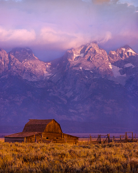
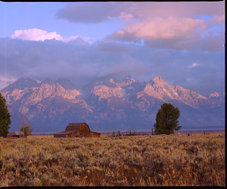
Here’s a jpg of the scanned and converted negative from Day 1 (i.e., higher temp and time periods). The colors are fully saturated and the amount of grain was very typical to what I see with Flexicolor chemistry on Ektar (i.e., very fine).  There were minor color shifts I had to correct in software, but again, they were pretty typical of what I see using Flexicolor chemistry on Ektar film.

Dignan2BathTest-9_4Kat6m-editcolorcorrection-hipass3px

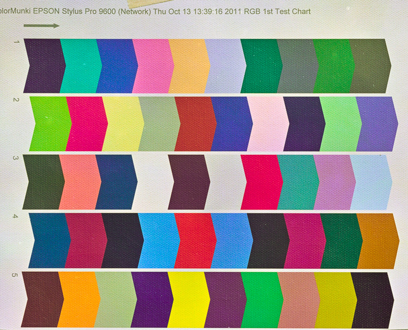
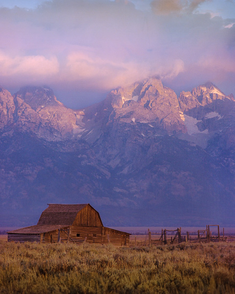
Even with the higher temperature and extended times that I used on Day 1, I still noticed some color mottling across the film frame that indicates uneven development. I saw this especially at the edges of the negative, and this was very obvious with the Day 2 negative, for which I used the published time and temperature specifications (75 deg F, 3 min Sol A, 6 min Sol B).  This tells me that I need to further extend either both time or temperature in both Sol A and Sol B. I don’t believe exhaustion of Sol B on Day 2 was the culprit because the pH had not changed. Instead, I  suspect that these modern films are engineered to maximize penetration of chemistry into all emulsion layers at high temperatures and short times, since the normal development of C41 is 100-103 deg F for 3:15 minutes.  I plan to adopt 100 deg F for 5min (Sol A) and 10 min (Sol B) as an arbitrary start point for further testing. I know this defeats one of the benefits of the 2 Bath workflow (i.e., room temperature processing), but it believe it will be necessary.

If you are searching for alternative C41 developers, you might try this old fashioned formula. It’s very simple, cheap, and should be robust.

Update 10/28/15:   I’ve been testing further. My thoughts above haven’t changed, but now I’ve developed a number of real negatives and I’m even more impressed with the NFC-41 workflow.  Scans well, minimal grain (Ektar and Portra films).  Some of the problems I’m seeing with uneven development have to be worked out. I typically use tray development, and I suspect that even though I’m getting good saturation in Bath A, it’s more important to agitate in Bath B to get even development. A couple of my negatives seem “undeveloped” in the centers of the negatives, where they have the most tendency to stagnate the flow of Bath B while in the tray. Tray development may not work here: either a carrier that can be taken from Bath A to Bath B without the need to manually shuffle the negatives, or perhaps using BTZ-like development tubes. I’ve used BTZ tubes before and they work great, but you have to constantly roll the tubes and that’s a pain.

Warning:  There is no real “buffering” power of Bath B. It’s only potassium carbonate and potassium bromide; no buffers. So be sure to use fresh Bath B for every set of negatives. I tried to test the capacity of Bath B by running several negatives before changing to fresh. The pH went from 11.9 (fresh) to 11.2 (used), and the last negatives were extremely thin. The bath volume was about 500 mls, and probably 5 drained negatives went through it. So, don’t trust that Bath B has much more capacity than a couple negatives..test it in your own workflow. One idea for stabilizing Bath B capacity would be to adopt a suitable buffer, e.g. Sodium bicarbonate: Sodium Hydroxide. The range of pH for this pair is 9.8-11, adjustable by the amount of NaOH added. Kodak Flexicolor pH is 10.03, and that should be the target pH of the bicarbonate buffer used in a putative “improved” Bath B.  I might try this. it would be extremely cheap and convenient since the ingredients are available as baking soda (sodium bicarb) and Red Devil ® Lye.

Update 11/5/2015:  After several more negatives, tray developed at 100 deg F for 6 minutes in both Bath A and Bath B, I haven’t stabilized the process. The image on the negatives has consistently been thin using this approach. That can be a good thing if you’re scanning your negatives like I do, but what’s happening with my technique is that I’m getting “too thin” negatives.  I’m giving up on this for the time being…may return for further experimentation later.


In image-making, you need to know the story before you can tell it.

Every picture tells a story. Sometimes it’s a story well-told, and sometimes not.

Just as a writer carefully maps out the setting, the plot, and cast of characters long before he/she begins typing a novel, visual story-tellers–those who make images instead of books–also will previsualize the story they want an image to tell.  Previsualization begins when we find or stage a subject that we believe has inherent artistic potential–i.e., has a story to tell–and leads to a point in time when we actually act on that belief by taking its picture or beginning to sketch on canvas.

In photography, previsualization is no less important than it is to any method of image-making. Often our eye will catch something we think has promise, but then we must exercise thoughtful previsualization to make the most of the story in front of us. In fact, previsualization must start with the story we want to tell, and all other compositional decisions we make should support that story.

One of the most important compositional decisions a photographer makes during previsualization is whether the final image will be in color or in B&W.

One good reason to decide on B&W film capture is the creative flexibility that B&W film lends to the photographer. If I can exploit this flexibility, I want to do that. Use of color subtraction filters and the ability to adjust film development to increase or decrease the contrast of the captured image are both good reasons to select B&W film over color film. Color film offers far fewer, if any, creative controls.

But first and foremost, the choice to use either color or B&W film should be based on the scene in front of the camera and what the photographer wants to say about that scene. In other words, does the presence of color support, or does it detract, from the story you want this scene to communicate? This is a question that is just as applicable to digital capture as it is to film capture, and it should be asked during previsualization.

It is so easy to defer the question of “color or B&W?” when shooting in color only, such as when shooting with a digital camera. Since the digital camera always captures the full color spectrum, the tendency is to just capture the scene and worry about converting to B&W later and see which, color or B&W, “looks best.”

This could be a mistake, regardless of whether you’re capturing to a digital sensor or onto film. The reason it’s a mistake is because you’ve also deferred the critical question: “Does my concept for this scene–i.e., the story I want to tell– require color? Does the color in the scene support or does it detract from that story?”  When shooting film specifically, deferring this question until later also means that by choosing to use color film, you have removed any opportunity to exploit the creative advantages that B&W film offers.

I follow the advice of the greats who came before me and try to nail down the story for every photograph I take long before I load the film into my camera and click the shutter. Nailing down the story is the first, and perhaps the most important, part of previsualization. The story not only affects the choice of color vs B&W, but also where to point the camera, choice of lens, and every other aspect of composition. I repeat, being in color or being in B&W is one of the strongest compositional decisions to make: it should be made during previsualization. You should know before you take the picture whether it should be B&W or color.

Deciding on color or B&W is an intuitive decision, and I admit that sometimes, I don’t trust my intuition and will capture the same scene onto both color film and B&W film. Most of the time, I learn that I should trust my intuition more.

Here’s a case in point:

Being Obvious (color)
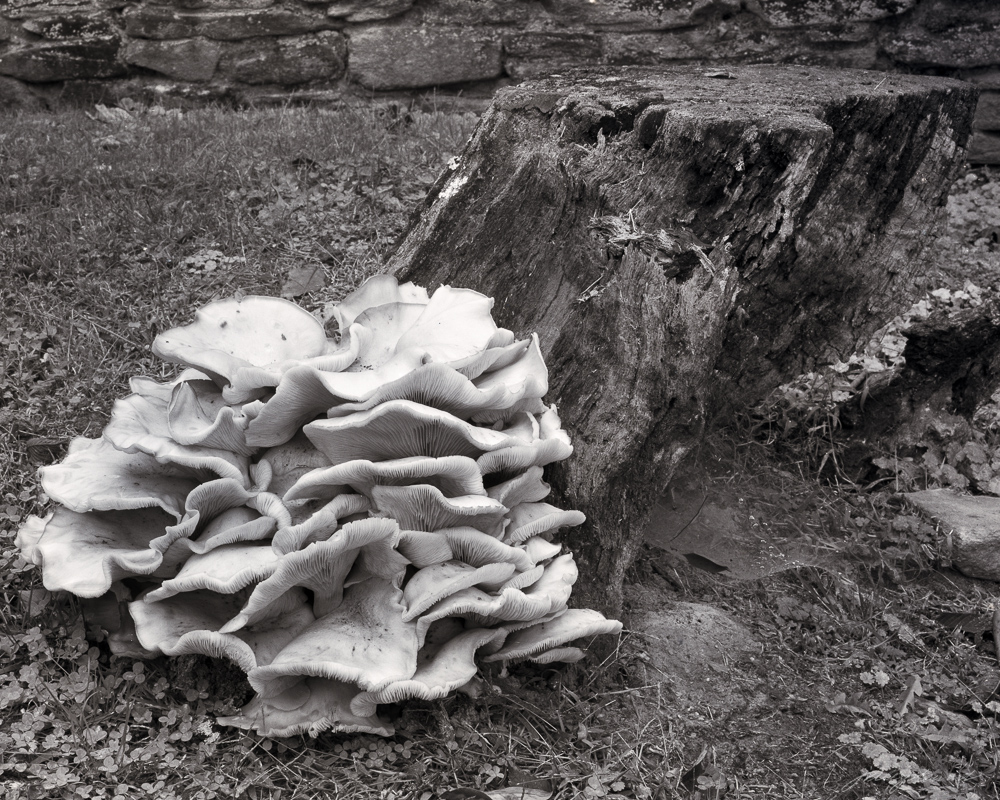
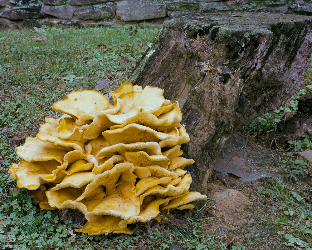
I came upon this massive mushroom this week while out walking on a local farm. It was more than 2 feet in diameter and rested in a bed of clover just at the base of an old dead tree stump.

What was immediately obvious was just how obvious this old mushroom was. It’s size and texture of course made it stand out from everything around it, but it’s color was intense as well. The yellow and orange hues really made it ‘different’ from the cooler greens of the surrounding grass and ivy, and from the old monochromatic stump.  The impression I had, and this became my concept for this scene, was “Being Obvious.”

From that point on, my single goal in taking its portrait was to support the concept of ‘being obvious.’ My intuition told me that it should be a B&W portrait, and by using a pale yellow filter I could enhance separation of the main subject from its surrounding cooler tones quite well. But its mushroom’s color was so intense that I began an inner argument with myself (i.e., with my intuition) that then caused me to take the portrait in both color and in B&W. Both portraits were taken in similar, flat overcast light.

The color portrait is interesting because of the subject, but I think it lacks balance, and the colors present in the scene seem to detract from the story of the mushroom “being obvious. The intense yellow/orange of the mushroom tends to share the space almost equally with the other two major colors: the blue green ivy and the brown stump.  In other words, the natural colors didn’t support my concept very well, even though intense.

I was glad I followed my first inclination and also took the mushroom’s portrait using B&W film. I chose to use a light yellow filter to deepen the tones of the cool green clover and lighten the tones of the fungus, thus exploiting the creative controls possible with B&W film.

Being Obvious
“Being Obvious” copyright 2015, J. Riley Stewart

The B&W portrait better segregates the mushroom from all other elements in the image; the ivy and stump are no longer competing for attention with the mushroom, and this change better supports my ‘being obvious’ story.  The B&W image also is better balanced than the color portrait, as I was easily able to lighten the tones on the far right of the frame to create that balance.  Brightening the same green ivy in the color photograph would not have accomplished the same result.

Had I not previsualized this scene and just took the pretty picture of the mushroom without thinking, I might not have  even thought to “see” this in monochromatic B&W, and would have failed to tell the best story for this fantastic, and worthy, subject.

Which do you prefer? Does this picture say something different to you? Would you have captured this portrait in color or B&W?

Leave a comment below! 

Behind the “photographer’s eye”

Falling Light, Grand Tetons “Falling Light, Grand Tetons” Cover feature for the February 2015 edition of Elan Magazine

I sometimes hear “you have a good eye” when speaking to folks visiting in the gallery. They are being complimentary of course, saying that they like the subjects, find them interesting, and clearly are worthy of a  picture. They might even have been emotionally affected by the photograph, an outcome every artist hopes for.

Making an emotional photograph requires so much more than the subject alone. It must also tell a story that moves people. Having a “good eye” isn’t nearly enough.

As humans, our eyes can see almost 180 degrees (a full semicircle) in front of us. There may be hundreds or thousands of distinct objects within that field of view, especially in nature. Including too many of them or putting them in the wrong position in the photograph will make it difficult to tell just what is going on.

Master photographer Ansel Adams once said “There is nothing worse than a sharp image of a fuzzy concept.” That was his way of saying that good photographs tell a clear, compelling story. And just like a literary story, the photograph must have a leading character –a subject– certainly, but it must also place that subject in context with other elements of the story in order to evoke an emotional response.

I think that telling a good story is the hardest part of creating art photographs. Sometimes the lighting isn’t right. Sometimes the colors or tones clash. Sometimes the rhythm is way off. Lighting, color, and rhythm are each important contextual elements that can either celebrate or belittle the best of photographic subjects.

I want to use “Falling Light, Grand Tetons” as an example of one approach to making an artful photograph.

A couple years ago I visited the Grand Teton National Park in Wyoming specifically to take pictures. One of my objectives was to capture a picture of the famous Moulton barn on Antelope Flats, one of the most photographed barns in America. A quick Google search illustrates how others have photographed this subject: Typical Moulton barn photographs

The image just below is an unaltered image of the scene that closely approximates what my eyes saw at the time. This view approximates what anyone would see if standing next to me at the time.

I saw a story in this scene. It was a story of human struggle on the high plains of the Grand Teton mountain range. The main subject was the old abandoned barn, dominated by the eternal, massive, menacing mountain range. To me, it was a story of humanity’s neverending fight with nature: in this case a battle lost by those who abandoned their homestead simply to survive.

But my story wasn’t being told very well in my first take. I felt my subjects were weak and not really as sublime as I wanted them to be. I needed to isolate the barn–my leading character–within the scene and make it appear more intimate with the mountains.  So I changed to a vertical perspective and replaced the lens with a zoom lens.

Falling Light, Grand Tetons

Compositionally, I felt that this was getting closer to my story: the barn was now isolated from the surrounding visual clutter and the supporting subjects (the mountains and foreground) were in the right proportion. Placing the barn near the bottom of the frame supported an illusion of pressure and force of nature upon it.

But things still lacked a strong sense of desolation and hardship that was important to my story. The tension and sublimity I felt on site was missing in the photograph; my camera had failed to capture my emotions (as it always does). In other words, other contextual elements were not supporting my story. I knew I’d need to modify them for my story to be told well.

This image clearly needed help with the lighting, so dodging and burning was called for. Dodging and burning are techniques used to brighten (dodge) or darken (burn) specific elements or areas of an image to create an illusion of light and shadow. These techniques have been used since the invention of photography, and I use them often as I artistically interpret my photographs. Here I felt the barn (and therefore the foreground grasses) needed brightening to make it clear that it was the subject of the story. The mountains also required a bit of contrast boost to make them appear menacing and stark.

The final important changes affected the colors in the image to emphasize rhythm and visual depth. Warming the mountain peaks and the foreground accomplished both. The warmer foreground advances toward you, inviting you into the scene, and the warmer mountain peaks improves the illusion of them hovering (dangerously?) over the barn. I felt the final result told the story I wanted to tell about this famous barn.

Making successful photographs requires much more than having a good “eye.”  Finding a great subject is certainly critical, but telling a story about that subject is so much more important. Not everyone will see the same story as the photographer. But this is true: if the artist tells a good story, it is much easier for someone else to emotionally engage in the scene and dream up their own setting, plot, or ending. And that’s what art is all about.

If you are an art photographer, here’s a trick I’ve found useful.  Force yourself to title the final photograph before you click the shutter. Use a conceptual title, such as “Falling Light”, “Fight with nature”, “desolation and abandonment..” or whatever reflects how you feel about the scene before you. Once done, you have a concept about the story you want to tell. That concept will then guide you as you compose and interpret the scene much better than a title like “Barn in the Grand Tetons”  or “DSC12345678-1.”

Happy storytelling.

Subscribe to our mailing list

* indicates required

Location

Email Format

View previous campaigns.


A tool for taking better pictures, and it costs nothing

Back before the popularity of digital photography, almost all serious camera artists used a simple tool to help them evaluate composition before ever setting up the camera. Using film meant you only had a limited number of possible pictures you could take based on the number of sheets or rolls of film you had with you.

Today, most digital cameras have large memory cards offering the potential to store hundreds of images at a time, and they provide an instant replay of the picture just taken on the rear LCD panel (this is called “chimping”). Digital photography has led many photographers into a habit of just shooting anything and everything, happily chimping along, hoping that when they get back to the computer they’ll find something on the memory card worth keeping. Of course, it can take a lot of time sitting in front of the computer to sort, analyze, and select the images to creatively interpret (or post-process). Personally, I find this workflow extremely tedious, extremely inefficient, and it drains my creativity instead of filling it.

There’s something rewarding about reading a scene before taking its picture. A good fisherman doesn’t just plop into the stream and start casting. A good painter doesn’t just set the easel down and begin painting eplein air.  Deciding where to fish successfully or what to paint successfully is a very deliberate process. What to photograph should be just as deliberate. Studying a subject helps us connect with it, and that connection will ultimately transfer to someone else who views the photograph and result in a good feeling, a bad feeling, or worse case..no feeling at all.

A  viewing card (or preview card) is a simple, no cost tool that photographers can use to wean themselves from the tendency to shoot and chimp all day long.  The rewards are many:  fewer pictures, better pictures, a greater understanding of composition, and a more intimate relationship with our subjects.

When I’m scouting for subjects eplain air, the only thing in my hands is my viewing card. It’s made from scrap mat board, about 8″ x 10″, with a 4×5″ opening to match the dimensions of my 4×5 camera. I’ve added a scale on one side that relates distance I hold the card from my eyes to match the focal lengths of the lenses in my camera bag. If I find the perfect composition to be what I see in the frame when held 9 inches from my eye, I know I’ll need my 125mm lens to capture that composition. I can turn it vertically or horizontally at will. I can get higher or lower to the ground at will. I can easily walk around scoping all possibilities at will. Only when (and if) I find a composition I like will I remove my camera from its bag. By then I already know which lens to use, where to approximately place the camera relative to the subject, and which perspective I need to use. All the while, I’ve also gotten to know my subject pretty well, my excitement is peaked, and I’m better able (I hope) to transfer that excitement into the image during creative interpretation.

Some might argue that simply using the camera viewfinder as a viewing card is just as effective as a cardboard viewing card. Perhaps.  But I find that when I set up my camera, my overwhelming tendency is now to focus on the camera and not on the subject. My whole frame of mind changes from seeing what’s in front of me to adjusting, clicking, adjusting, clicking. Once the camera is mounted on the tripod, I quit moving around and settle for wherever it happens to be. Once the camera is mounted in horizontal (or vertical) perspective, it typically stays in that perspective. And it’s much more difficult to compose a scene in a camera’s small viewfinder than it is with a larger viewing card. With my eyes embedded in the viewfinder, I find it very easy to totally neglect everything beyond that field of view. Did I miss that bird flying around just outside my view? Or that mountain lion? Or that hiker/kayaker/climber? Or that beautiful cloud formation? Possibly.

Try this next time you are out shooting and let me know how it goes. I suspect you’ll find this simple tool very helpful.


The downside to the digital photography revolution

Update Oct 2019: I wrote the article below in 2012, and much has changed in the digital photography realm since then. Unfortunately, much has stayed the same.  First, hi-end digital camera resolution has improved greatly, and has surpassed 35mm film captures. But that has very little to do with art photography. Second, processing software now enables anyone with a digital image to ‘stitch’ captures and make huge digital files capable of huge prints. But that also has very little to do with art photography. Third, we now have very good graduated filters that help manage the luminance range of landscape scenes to accommodate the (still) limited dynamic range (DR) of digital cameras. I have nothing critical to say about DR management filters; I never use them; never need them with my analog workflow.

But the biggest change in digital photography has been, in my opinion, that many digital photographers have learned how to create magnificent images from digital cameras. There are more photographic artists who have converted from analog to digital and forced themselves to learn how to use the digital tool, and they’ve done it very very well.


Article from 2012..

I was recently talking with a friend about digital photography. As we discussed the differences between digital capture and film capture, I blurted “..I think digital photography is the worse thing that could have happened to photography as art.”

The conversation went on, “blah, blah, blah…” and we finally went on about our business. Later, however, I thought “why did I say that? Did I really mean it?”

Those of you who follow my blog know I consider myself to be among the shrinking class of photographers who still use film primarily. I use my Nikon D200 digital camera for some things, but if I’m taking a picture of something I think is important, I’ll use my Nikon F5, my Mamiya RB67 medium format (film) camera, or my Cambo 4×5.

“Purple Mountains Majesty”  Captured using a Mamiya RB67 Pro S camera onto Kodak Portra 120 size film and scanned using an Epson V700 film scanner.

But back to my topic: why did I say such a terrible thing about digital photography? Here’s a list of serious consequences that I think represent the downside to the digital revolution; you be the judge how important they are to the art of photography as you practice it.

First a caviat: I consider photography to be the technique of creating an image that depends on light reflecting off a physical entity(ies), striking a light sensitive surface, and thus creating a 2-dimensional representation of that physical entity. Significant manipulation of the 2D representation  after capture can cause a departure from photography and into digital art (each artist defines his/her own limits in this regard.)  While digital art may use a camera as a tool to create such art, I do not consider digital art and photography to be synonymous.

My other bias is that I also have a personal dislike for what we used to call “chalk and soot” in fine art images.  These are large spaces in a photograph that are devoid of any detail in the shadows (soot) or in the highlights (chalk). In either case, such artifacts become distractions because our brain sees them as “unbelievable.” If you’re creating landscape photographs that have distractions, and there are many types, it will discourage many viewers from further engaging in the image. In digital terms, “chalk and soot” is the same thing at “clipping” at the extremes of the light spectrum.

So, here’s my list of reasons why I think digital technology, as applied to photography, has destroyed the art of photography:

1.Tiny, low resolution pictures are the norm. There was a time when most pictures we saw were at least 4×6 inch prints; and commonly 8×10 (the size of a magazine cover) and larger, and printed at 300 dots per inch or greater. The norm today is 3×3 (or less) shown on an excessively contrasty monitor showing us  much lower resolutions of 76 dpi.

I believe one of the great human values that photography provides is the opportunity to see and explore real, factual subjects with much greater depth than is possible in the ‘blink of an eye.’  Studying a low-resolution 3×3 inch thumbnail on our display monitors is just, well, impossible. It’s a superficial study at best, and therefore misses the whole point of the value of photography in our lives. While many photographers who post images to the internet exceed 3×3 inch (thankfully), resolution is still largely limited by the display technology. To really see an image for what it is, you need to see it in print, big, and in Hi-Def.

2. It’s not about getting good pictures now, it’s about getting fast pictures. There was a time when most people who took pictures truly wanted the picture to be “good.” Sadly, the norm today is to snap the damn thing, get it up on Facebook to share, and don’t worry about fuzziness, poor lighting, distracting objects, etc. It’s fun to share, but the ease of taking pictures today that don’t cost a dime has certainly reduced incentives to ‘make a good photograph.’ If you want to see an example of my point, just scan a few Facebook galleries of your friends. I’ll bet you’ll agree with me that the vast majority are really bad photographs (but we’ll never say that in public; nor should we I guess.)

3. With a digital camera, “this is the best I can do”. There was a time when skilled photographers took great care to avoid distracting artifacts in their imagery. Proper exposure, proper placement of the camera, and proper selection of camera and lens were fundamental considerations any serious photographer made for every click of the shutter.  Today it’s common to see artifacts such as distracting, featureless blacks and pure blown-out whites, fuzziness, photographic noise, and others that are typical with digital capture,  even from experienced, well-known photographers. This is, perhaps, my biggest gripe: that serious photographers seem to have compromised photographic quality for ease in ‘picture taking.’ Some say digital is the form that today’s photographic art has taken. And based on the popularity of digital cameras over film cameras, perhaps they’re right…. but I hope not.

4. Digital is a plastic technology. Digital photography is very “digital.”  Our eyes don’t see things in digital format, they see things in analog format. So does film, by the way, it responds to light in analog form.  WIth digital image capture we get super crisp lines and sharp transitions between colors. Perhaps the best way of characterizing this effect is “plastic.” Yet our eyes see and interpret lines and colors  having smooth transitions.  If you want to produce images that most closely mimic what our eyes and brains see, you must capture the subject using an analog technology, not a digital one.

This list is a start. While digital technology has given us the ability to take and share pictures so much more easily than before (and this is a good thing, much like the Kodak Brownie introduction in 1888), digital’s popular adoption for fine art photography, and especially for landscape photography, has so far been overwhelmingly bad. As the technology develops further it may overcome its present limitations for capturing subjects having wide latitude, with minimal noise, and excessive “plastic” character.

But that day isn’t here….. yet.

Subscribe to our mailing list

* indicates required

Email Format

View previous campaigns.


Myths About Scanning Film for Maximum Quality

Update 3/31/2016

I published this article back in 2011, and at that time I had 3 years experience personally scanning negatives. Add 5 years since, and probably 500 hours scanning, and well, you get the picture.

________________________
This article dispels many myths related to the technical process of scanning negative (print) film. Developing photographers may save themselves time and money and produce higher quality scans by knowing these myths exist.
_____________________________

It bears repeating: Take lessons you read on the internet (or anywhere) with a grain of salt unless it comes with substantiating explanation.

I like reading “tips”, “lessons”, “warnings”, “advise” etc from posters on internet blogs or fora. It helps me understand what others have found to be useful so that I might use this information to solve my own problems. Believe me, growing up in the pre-internet era makes me very thankful that we now have the wealth of information available at our fingertips.

Scanning film is a necessary evil for photographers who choose to use a hybrid workflow, where film is used to capture the image and digital processes are used to produce the final image for sharing or printing.  For whatever reason, the art of communicating film scanning techniques by those who choose to  do so is like reading early software “user’s manuals”: Users couldn’t understand a word in them.  If you’re an electronics engineer, you might find that last statement funny (or not), but it’s still true. But unlike modern software developers who have learned how to communicate clearly to non-technical users, scanner developers have not.

I’ve been scanning color and monochrome negatives for about 3 years, and I think I’ve just about got it down. I can produce a digital scan of a 35mm, 6x7cm, or 4x5inch negative without unacceptable noise having very high resolution, and requiring only minimal corrections in my imaging software. My success isn’t so much due to what I’ve read in the blogs or scanning fora as much as it is about TENACITY. Which brings me to my point: Don’t take for granted that what you read in the blogs means exactly what you think it means or that it even applies to your own photographic situation.  This is doubly true if the blogger fails to substantiate (or thoroughly explain) what he/she really means, and ideally includes pros and cons with their recommendation.

Here are examples of myths I’ve read on expert sites that I accepted as truth, didn’t take the time to investigate them on my system using my workflow, and which literally set me back weeks to months in getting to the level of scanning competence that I have currently:

Myth 1. “Scanner manufacturers claim much higher resolution than they can actually deliver, so there is no need to scan above 2400 ppi.”  I use an Epson V700 scanner that Epson claims can scan at 6400 optical resolution. It also has a lower resolution lens that can scan at 4800 ppi. Experts have repeatedly scoffed at Epson’s claims, and have consistently recommended not to scan above 2400 ppi because “..you won’t get any better details from the shadows above 2400 ppi.”  What I’ve learned in my experience is that while I may not get additional shadow details when scanning at 4800 or 6400 ppi, the digital file produced is much better. I’ve found that with this scanner, when using the OEM negative holders provided to ensure optimal focal point of the higher resolution lens, I do not get what I presume is aliasing in the digital file. The effect I get when scanning at low resolution is best termed ‘blotchy’ –clear blue skies looked like wet cotton candy.  When scanning at the optical resolution of one of the lenses, clear blue skies look more like clear blue skies. For whatever reason, forcing the V700 to scan at less than the highest optical resolution for the lenses seems to produce artifacts in the scanned image.  Based solely on the quality of the resulting image, I always scan at the highest optical resolution. Yes, this requires more time scanning and more disk space, but it is the technique that produces a result that is minimally acceptable to me. I deal with the disk space requirement by buying more disk space. All of my negatives that don’t deserve printing are later compressed to “proof” resolution and archived at 5 megapixels or so.  (I always have the negatives that can be re-scanned if needed.)

Myth 2. “Scan at the minimum resolution for your intended purpose and do not compress the file.” Update:  I no longer consider this to be a myth..I’ve found it to be a good practice. But since my intended purpose is to make really large prints, I’m always scanning at maximum resolution to get the largest file size I can. 

Myth 3. “Don’t use the scanner software to set the contrast levels or balance the color; do these tasks in your image processing software instead.”  Again, until I investigated this, I abided by the expert advice and then fought the losing battle of adjusting the levels and colors in Photoshop or Lightroom without ruining the quality of the image. The result was excessive artifacts, noise, and artistic frustration painted all over the images. What these experts must presume is that every negative is perfectly exposed and taken in the best lighting God can make. As a landscape photographer, such circumstances are very rare. I typically express images that have wide latitude (meaning deep blacks and paper white highlights). If a negative has no such attributes, I will adjust the contrast to produce them.   Whoops…adjust too much and the histogram will look moth-eaten and introduce compression artifacts in the image. The more you adjust, the worse it gets.  What I’ve found works best is to get really close to the final image contrast and color balance using the scanner software. This means much less fidgeting in post-process and fewer artifacts in the final image.  Update:  I still find that the scanner algorithms for converting the continuous tones of a negative into digital bits is better than how Photograph CS5 or Lightroom 4.0 converts one tone to another.  Even my 1980s-era Howtek 4500 drum scanner does a better job than CS5 or LR at setting levels, white/black point, and perhaps even curves.

As an example, the two images below are from the same negative. The left image is straight from the scanner without any post processing; the right image received minor enhancements to adjust local and global contrast, saturation, and highlighting. No artifacts resulted from the post-processing. The negative was captured using a Nikon F5 onto Kodak Portra 400 film. I scanned the 35mm negative at 4800 ppi using VueScan with no compression. This produced a 30 megapixel image file. In Vuescan, I locked the film base color to neutral black and the image color to neutral white. Modest post-processing included cropping, adjustment to both global and local contrast, minor sharpening (but no output sharpening), and targeted adjustments to brightness and contrast to the foliage and water. The full resolution image has no processing artifacts that I can see at 100% zoom.

If you find yourself fighting your post-processing technique on flat, low contrast scanned negatives produced using the common expert recommendations, then break the rules.  Set levels and color balance in the scanner software and see for yourself if the final result is better.

Myth 4. “Scanning wet mounts will result in higher quality scans.”  Well, I tried this and found no difference in quality of the resulting scan, just a lot of additional work and cost. The scans I get using Epson V700 negative carriers, scanned at 4800 ppi, have the same detail in the shadows, the same detail in the highlights, and have the same latitude as those scanned using KAMI wet mount system. I did note that I didn’t have the dust problems when using KAMI, but otherwise I noted no improvements.  Update:  My main scanner is now a drum scanner, which requires wet mounting, so of course that’s what I do.   I think the point should be made that sometimes, you need to do what you need to do. If you have a terrible dust problem in your scanning workstation, you may find wet mounting really helps, and may be essential.  There is a far greater difference between a CMOS scanner (desktop scanner) and a PMT (drum) scanner then there is between wet mounting and dry mounting. 

Myth 5. “Amateurs use negative (print) film and professionals use transparency (slide) film.” The implication here is that transparency film somehow has qualities that so far surpass print film to make print film significantly inferior.  Such statements could lead developing photographers to adopt the use of transparency film without even exploring what I consider to be the strong points of print film. When I decided to begin shooting color about 4 years ago, I made the decision to use print film precisely for the reasons most “experts” claim as its weaknesses: exposure latitude and development latitude.

Transparency film typically has a 4-5 stop exposure latitude, about the same as most 2005-era digital cameras could detect. In landscape photography, a typical scene can deliver brightness ranges spanning 8, 9, or even 10 stops or more. This means that the photographer has to decide at the time of capture, whether to clip the shadows and lose most low light detail or to clip the highlights.  Digital photographers are well aware of this situation; most digital sensors also have latitude limitations that result in ‘blown out highlights” or “dumped shadows.” Fortunately for digital photographers, the technology is improving as new sensors are invented.

Print film has no such limitations. In fact, print film can capture the thinnest density having detail on the negative (i.e., the deepest shadows of a scene) while also capturing fine details in the most dense areas (i.e., bright whites like sun lit clouds). Easily.

Scanners of the qualify of my Epson V700 also have a very wide latitude of detection. The figure below is a scan of a 31-step density wedge made on the Epson V700. Each step is 1/3 of a stop from its nearest neighbor, so from one end of the strip to the other is 10 stops. When I scan this step wedge as in the figure below, I can easily detect 31 distinct steps, indicating that the V700 has a detection latitude somewhat over 10 stops.

As a practical example, the scene below presented me an extreme range of brightness. This range had to be captured in one shutter click due to movement of the water, the geyser eruptions, and the sun. Then, the scanner had to detect detail in both the sun and the shadows among the foreground grasses. The picture was captured using Kodak Portra 400 film, with no neutral density gradient  filters used. I developed the film  normally. The original scan retained detail/color in the sun spot and the shadows concurrently.  If I had captured this using a digital camera or if I had used transparency film, this scene would have required multiple shots and later processed using HDR techniques and/or by compositing multiple images, which can introduce their own artifacts in the final image. Shooting with print film gave me the exposure latitude I needed to capture this scene.

I admit to never using slide film for my artistic work, so my experience is limited. However based on the knowledge that slide film has a much narrower latitude and my own experience using print film with its proven (in my hands) wide latitude, I completely dismiss expert contentions that “professionals should use transparency film while amateurs use print film”.  Don’t hesitate to use print film seriously. I’ve found that much of my landscape and nature images require the exposure latitude that only print film can deliver.

If this article helps you decide to try scanning print film or if it simplifies problems you’ve had in your scanning techniques, then it accomplishes its purpose. While the internet forums are full of information, take what you read with a grain of salt. The information is only accurate in the hands of the writer and may not relate one bit to your situation. If you have the time to test such advice, that would be a wise decision. It just may save you a lot of time and money.

Update:  To be serious photographers, we have to invest in equipment we need.  We need to learn the techniques that are important to our craft. I’ve never been one to collaborate with others in creating my photographs, and that means outside film scanners, printers, etc. If you want to use the hybrid workflow, then go ahead and invest in a scanner, learn to use it, spend the time testing various ways to get the job done using the equipment you have. At the least, the growing interest in film photography these days means a growing market for used equipment, so you can always sell the scanner later if you decide scanning is not for you!

J Riley Stewart

Film vs Digital: Insights from the High End

I’ve written already why I continue to shoot my landscapes with medium and large format film vs digital technologies. I want to share with you in this article some additional reasons why there continues to be a large group of us who do so.

I just returned from 2 weeks in the Yellowstone and Grand Tetons National Parks in the USA. These spaces epitomize the best the world has to offer in grand mountain landscapes. If you’ve never been, I hope you get to go soon.

To lay some groundwork, I traveled with two camera bags: one filled with my 35mm gear and the other with my 120 medium format gear (a Mamiya RB67 Pro S). I use the 35 mm to shoot wildlife and the medium format to photograph everything else.  What was on my tripod 99% of the time? The medium format camera. I used 22 rolls (220 frames) of either Ilford FP4 B&W or Kodak Portra color film. That’s a lot of shots, but these Parks definitely are “target rich environments” for landscape photographers!

Each of these frames of film were deliberately composed. By that I mean a series of detailed steps that ultimately result in a properly exposed capture of a scene onto the film. Very quickly, the steps include 1: envision the photograph, 2: place the tripod, 3: decide color vs B&W, 4: install the camera on the tripod, 5: quickly view through the lens, 6: change the lens if necessary, and attach the shutter release 7: adjust the tripod head to achieve the composition I wanted, 8: focus to determine the required aperture, 9: set the aperture and focus, 10: determine the correct time associated with the selected aperture (I use both incident and spot meters to do this), 11: set the time, 12: wait for the exact moment to occur if there are moving clouds or lighting changes occurring, 13: trip the shutter, .reset the shutter release, and advance the film, 14: repeat steps 1-13 as necessary to capture a different scene.

You can see it takes a bit of time to capture each and every scene using this technique, so I’m there for awhile. (I had to wait for Old Faithful for over an hour). Being in a National Park, rarely was I alone. While I was composing or waiting for the moment to arrive, I would often see out of the corner of my eye several other visitors walk up and snap a picture, then get back into their cars and zip off the the next interesting place. If they linger at all, it’s to come over to me to see what the heck I’m doing and ask about that ‘big camera.’ If they do come over, I always stop to talk to them to share ideas. After all, this is fun stuff, and I always get a kick out of what they tell me about themselves, what they’ve seen at the Park, or what they like to photograph. I even let them look through my viewfinder if they ask (and they often do).

If you are typical, you’re probably thinking, “..that’s a lot of trouble to just take a picture.” And this is just where it begins. I still need to develop and scan the film, then process the file into an image for printing. So why do I do it?

Simply put, I shoot medium format and larger film sizes because it makes a huge difference in the quality of large wall-sized prints you can make with these images.

While in Jackson, Wyoming (a popular portal to the Grand Teton National Park), I had a chance to visit 3 photographers’ galleries. Jackson is a very ‘artsy’ town, having a dozen or so art galleries within a few square blocks. All three galleries were what I’d call ‘high end’, meaning they offer and display very large photographs, up to 50 x 96 inches or thereabout.

Without exception, the artworks displayed in each gallery was absolutely beautiful. Extremely fine details even at these large sizes, beautiful coloration and composition, and beautiful finishing. Two galleries I’d highly recommend are John Richter Photography (http://www.johnrichterphoto.com) and David Brookover Gallery (http://www.brookovergallery.com/). Both artists have exceptional gallery designs and artwork in large sizes.  Both are high end artists, selling their larger creations in the thousands of dollars range.

Would it surprise you to know that neither Richter nor Brookover use digital cameras to create their masterpieces? On the contrary, John typically hauls a 4×5 Toyo film camera around, and David uses one of  two 8×10 film view cameras he owns (both were on his gallery floor when I visited, waiting for their next field trip).

I attribute the quality of their images to the fact they use larger format film cameras. This medium is capable of producing the equivalent of a 500 megapixel (for 4×5 scanned images) to 2 Gigapixel (for 8×10 scanned images) for each picture. There are many other finer attributes of film-captured images for these larger formats, but I’ll leave it at a pixel comparison for now. The most capable 35 mm digital cameras achieve 24 megapixels. You can buy digital backs for medium format and large format cameras, but you may need to sell your house first.

To put things into perspective, I know there are a great number of very successful high-end fine art photographers who use digital cameras. But when I look at their artwork (and I did, by the way, when in Jackson), I can definitely tell it. There is no comparison between their large prints and those of Richter and Brookover in terms of technical and artistic quality. That doesn’t make them ‘bad,”  just not as beautiful to my eyes.

They say that an artist should study the works of those they admire in order to develop as an artist. Well, I’ve added two artists to my admire list, Richter and Brookover. The experience of getting to see their art first hand, in their own presentations, was inspiring. I’ve also crossed off any idea of becoming a purely digital photographer in the distant future. I’ll continue to shoot some subjects digitally for specific applications, but if I’m shooting a scene that I think will look great hanging over a sofa (for instance), I’m pulling out my medium or large format cameras, and shooting film, every time!

Let me know if this has convinced you to drag out that idle film camera, or if you want to try medium or large format cameras for those special scenes you come upon. I’ll be glad to discuss the introductory steps with you.

Happy viewing!

Jim

A different view of the natural world

I only recently discovered the potential of abstract photography. I knew abstract art existed, of course, but I’d never even considered it as something I wanted to spend my artistic time on.  But about a year ago, I listened to several very successful fine art photographers talk about their approaches to abstract photography, complete with examples, and I was amazed at how beautifully nature can be depicted as abstractions.

Several months passed before I actually tried abstract photography. I was shooting at Chincoteague last Spring. While I normally attach my camera to a good tripod to ensure a sharp capture, on that day the wind was blowing so hard I could hardly stand up, let alone expect a tripod to firmly anchor my camera. So I took my camera in hand and thought I’d try this ‘abstract’ stuff. My subject was to be the salt marsh grasses violently yielding to the aforementioned wind.

I remembered one of the experts describe how moving the camera while clicking the shutter is a common technique for abstract art (there are several others). So that was what I’d try on my virgin attempt. The wind had the grasses of the salt marsh bent over about 45 degrees. I carefully practiced moving the camera parallel to the grasses, then actually took a couple frames.

Digital is great because you get immediate feedback by looking at the LCD screen on the back of the camera. After a very few tries, this is what I saw on the LCD, and I very much liked it.

Salt Marsh, Chincoteague NWR

The technique itself is straightforward and very rewarding if an abstraction is what you are after. Use a slow shutter speed so that there is distinct motion during the exposure. How slow will depend on how fast you intend to move the camera. Certainly, if your shutter speed is 1/100 sec, you need to be moving the camera pretty darn fast, and hold onto it very tightly. I recommend a much slower shutter speed- 1/2 to 1 sec even. Set that first, then meter the scene to see what aperture matches that speed. Remember that small apertures are okay, e.g. f/22 or f/32. Diffraction limitations seen at those apertures are not a concern with abstractions. Then experiment. Try different shutter speeds, different directions of movement (even circular), and various magnitudes of movement. Very small movements of the camera will give different results than large movements. By the way, this technique is even adaptable to camera phones, and Tony Sweet and others have written several articles about this.

Because of the fluid conditions used in abstract photography, the images created are exceptionally unique. In fact, I find it very difficult to reproduce a frame after I’ve captured it. I produced most of the linked abstractions below within an hour of one another and within 10 steps of each other. The landscape was a very popular and well-photographed waterfall (Elakala Falls) in West Virginia. This natural landmark has been captured photographically a million times. So after I took a few traditional pictures that I suspect will look like everyone else’s, I thought abstractly!  I’m glad I did.

Abstract art has a definition, but I’ve found that it is only loosely applied. The strict definition goes something like:  “..if you can tell what the subject is, it ain’t abstract.”   Others consider even traditional black and white images to be “abstract” because B&W doesn’t represent the real scene factually (i.e., it’s missing color). Thus, it is ‘abstract.’  I don’t know where, or if, there is a line between representational and abstract art, and frankly I don’t really care. I’m sure someone will correct me if I mis-characterize my art as “abstract” one day when it’s not. I’m prepared to wait.

What are your experiences with abstract photography? I’m definitely a novice at it, but I’m very pleased with this approach to create unique images of well-photographed places. I don’t see abstract replacing my current style, but I’m not going to limit myself and my art for the sake of being traditional, either. I see abstractions complementing my traditional fine art photography.  As long as I have fun with it and as long as the images I produce are pleasing to me and my audience, I’ll keep it in my art toolbox.

Let me hear your comments!

Jim